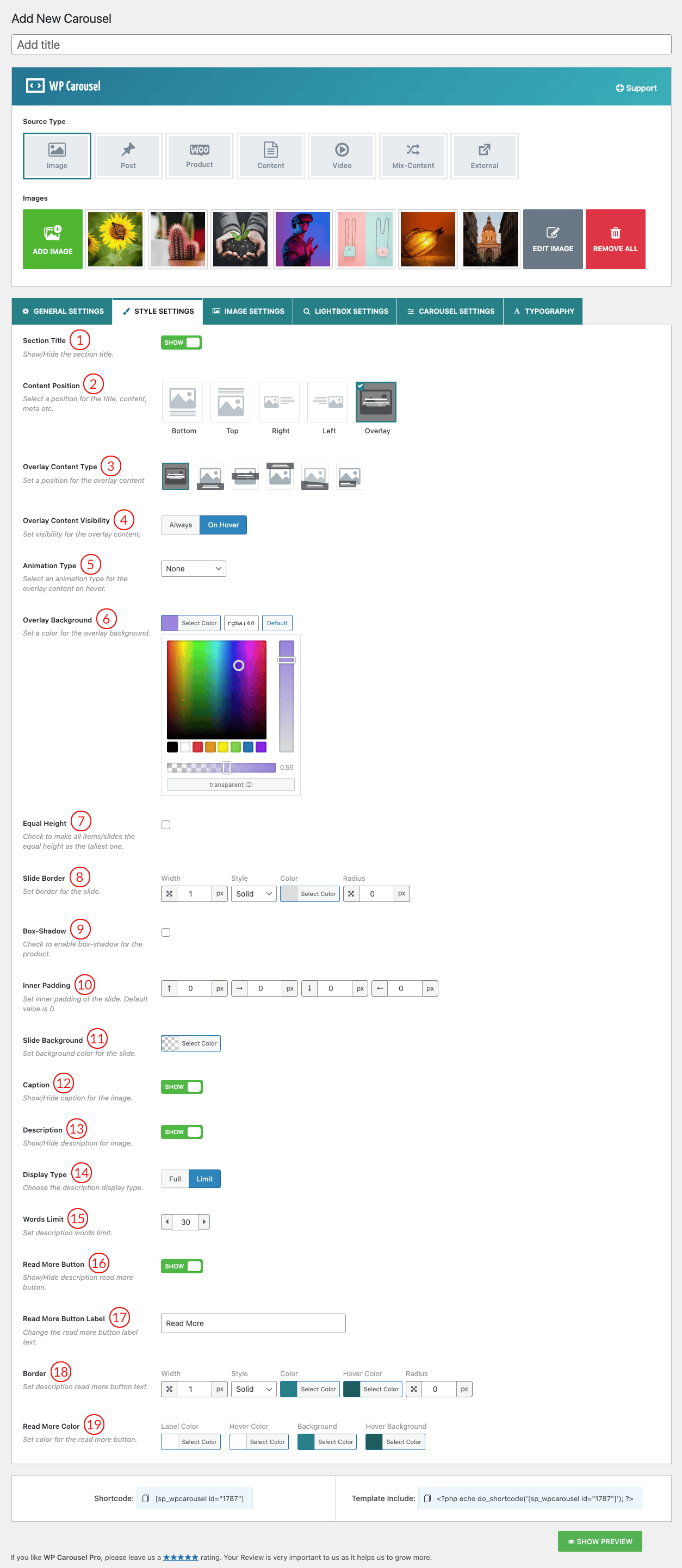
(1) Section Title: Show or hide the carousel section title from here.
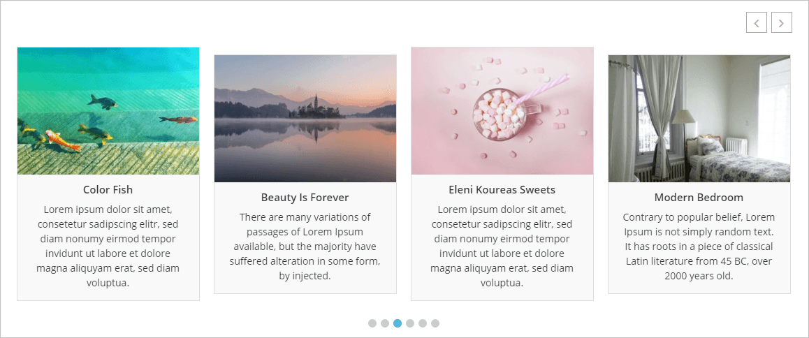
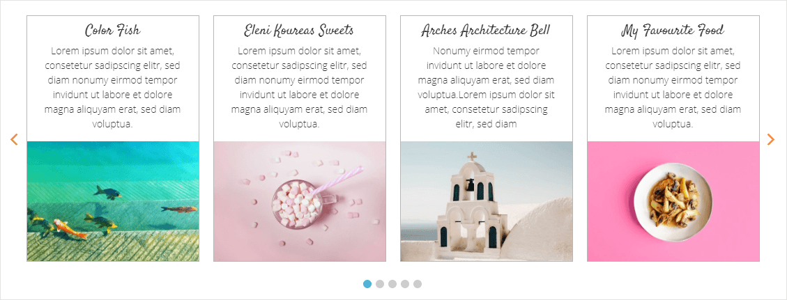
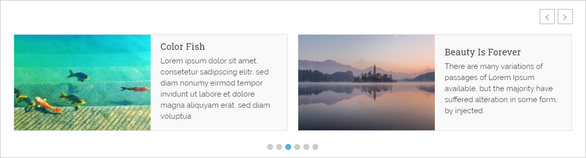
(2) Content Position: Content position is where you want to display your carousel item contents. Select a position for the content title, description, meta, etc. Options are below:
A. Bottom: Content will display Below the image.
B. Top: Content will display Above the image.
C. Right: Content will display at the Right of the image.
D. Left: Content will display at the Left of the image.
E. Overlay: Content will display when users hover over an image
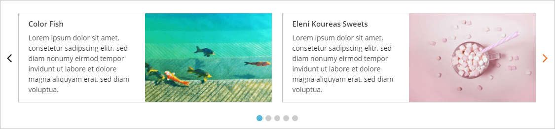
A. Bottom:
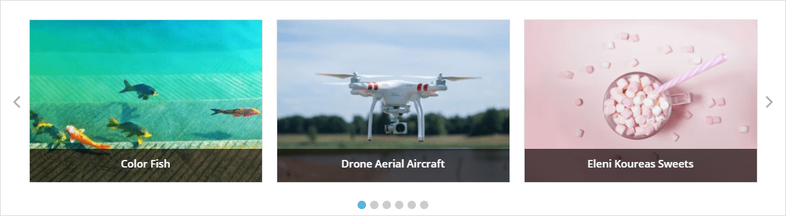
B. Top:
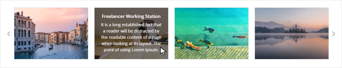
C. Right:
D. Left:
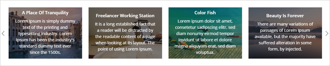
E. Overlay:
(3) Overlay Content Type: This option allows you to set how you want to show your carousel content on an overlay. Available options are below:
- Fully Covered: If you choose the Fully Covered option, it displays on the screen above like the E. Overlay Content image.
- Caption Style: If you choose this option, it displays like the below screen. A few styles are available here for caption style.
(4) Overlay Content Visibility: You can set Overlay Content visibility in two ways. They are as follows:
- Always: Check the Above E. Overlay Content image to see how it looks.
- On Hover: Check below to see how it displays on the screen:
(5) Animation Type: Select an animation type for the overlay content on hover.
- None
- fadeIn
- fadeInDown
- fadeInRight
- fadeInLeft
- fadeInUp
- flipInX
- flipInY
- slideInUp
- slideInDown
- zoomIn
- zoomInDown
- jackInTheBox
- rollIn
(6) Overlay Background: Set a background color for the overlay.
(7) Equal Height: Check to make all items/slides the equal height as the tallest one.
(8) Slide Border: Set border around the carousel Item. There are 9 different border styles. You can also set your desired border color.
Border Styles are:
- Solid
- Dashed
- Dotted
- Double
- Inset
- Outset
- Groove
- Ridge
- None
(9) Box-Shadow: Check to enable box-shadow for the product.
(10) Inner Padding: Inner Padding is the space that’s inside the carousel item between the item and the border. The default value is 0px.
(11) Slide Background: Set a background color for the slider item with this option.
(12) Caption: You can Show/Hide image Captions with this option. By default, the value is Show.
(13) Description: This is the option you can Show/Hide the image Description as you wish. By default description is Hide.
(14) Display Type: Choose the description display type.
(15) Words Limit: Set description words limit.
(16) Read More Button: Show/Hide description read more button.
(17) Read More Button Label: Change the read more button label text.
(18) Border: Set description and read more button text.
(19) Read More Color: Set the color for the read more button.