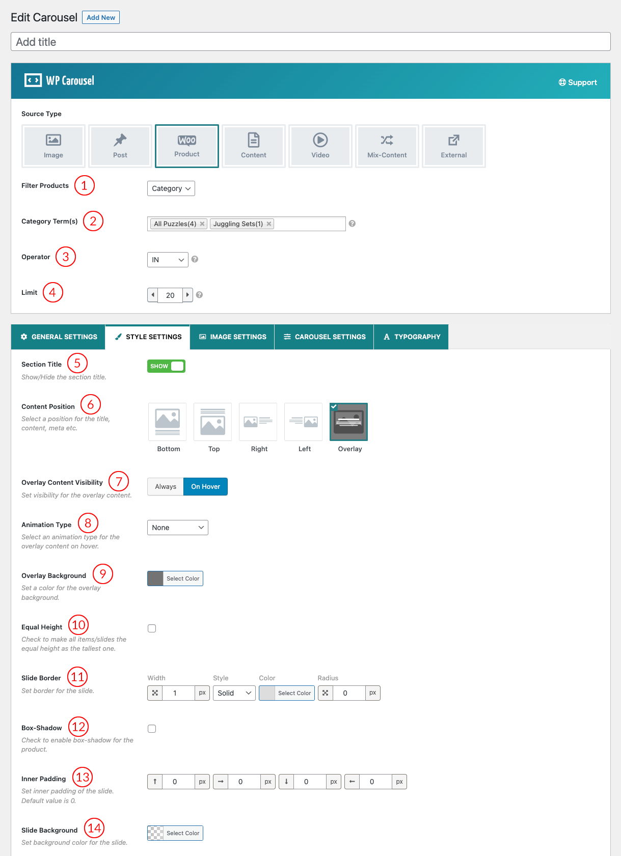
(1) Filter Products: Select one for Filtering the Products. You can choose among:
- Latest: If you choose this option, All the latest Products will be displayed in the Woo Product Carousel.
- Category: Category is the way to organize your products into categories and Subcategories. Select Which product category you want to display in the Woo Product Carousel.
- Specific: When you select this option Only your selected product will be displayed in the carousel. Set Products in the Select Product option that you want to show in the Woo Product Carousel.
(2) Category Term(s): When You select Category from the Filter Products option this option will appear. Set Which Product categories you want to display in the Woo Product Carousel.
(3) Operator: Select the Category Term Operator to show the products. Options are:
- IN: Show Products associated with one or more terms.
- AND: Show Products which match all terms.
- NOT IN: Show Products which don’t match the terms.
(4) Limit: Set the Number of Total Products to show in the Woo Product Carousel. The default value for the total product is 10.
(5) Section Title: Show or hide the Carousel section title from here.
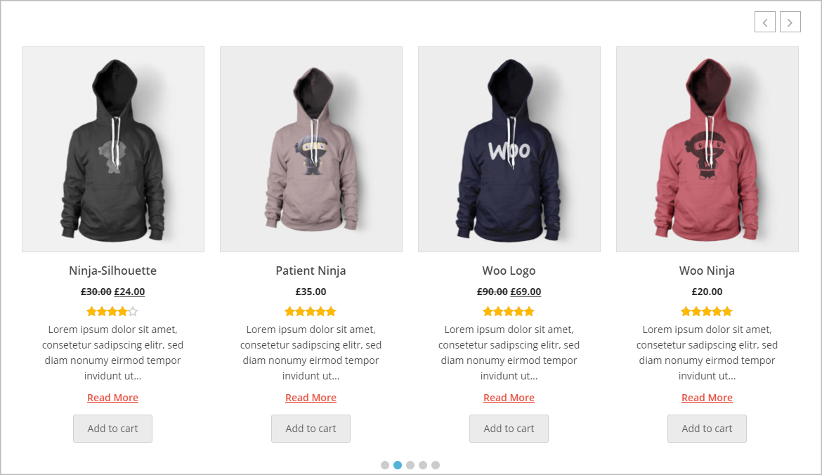
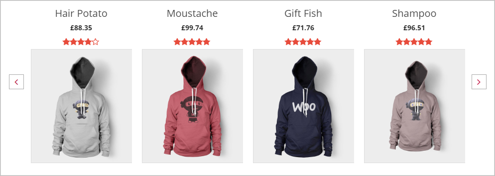
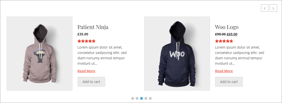
(6) Content Position: Content position is where you want to display your Product content. Select a position for the Product Title, Description, Category, etc. The options are the following:
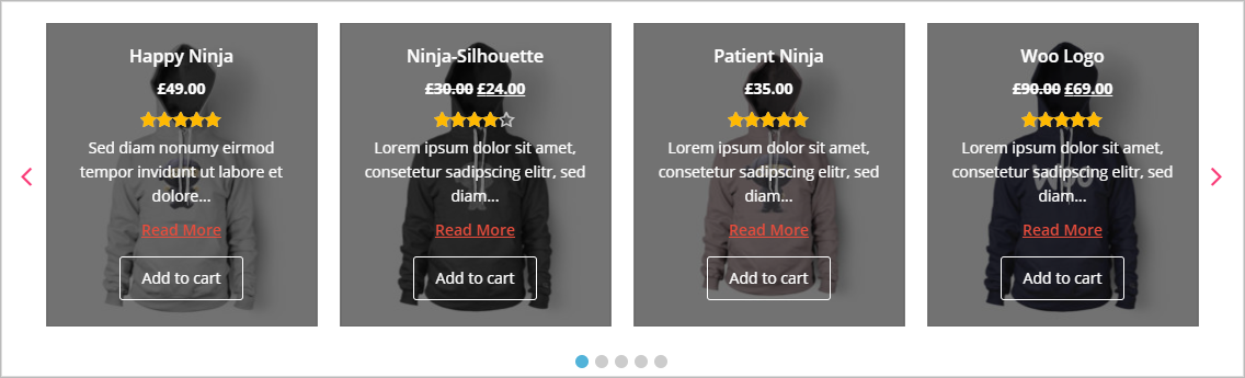
A. Top: Product Content will display Below the image.
B. Bottom: Product Content will display Above the image.
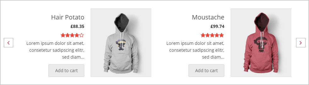
C. Right: Product Content will display at the Right of the image.
D. Left: Product Content will display at the Left of the image.
E. Overlay: Product Content will display over a product image.
The above options are given below with the screenshots example.
A. Bottom Content Top Product Image:
B. Top Content Below Product Image:
C. Right Content Left Product Image:
D. Left Content Right Product Image:
E. Overlay Content:
(7) Overlay Content Visibility: Set visibility for the overlay content.
- Always
- On Hover
(8) Animation Type: Select an animation type for the overlay content on hover.
- None
- fadeIn
- fadeInDown
- fadeInRight
- fadeInLeft
- fadeInUp
- flipInX
- flipInY
- slideInUp
- slideInDown
- zoomIn
- zoomInDown
- jackInTheBox
- rollIn
(9) Overlay Background: Set a color for the overlay background.
(10) Equal Height: Check the option to make all items/slides the same height as the tallest one.
(11) Slider Border: Set the border for the slide.
- Solid
- Dashed
- Dotted
- Double
- Inset
- Outset
- Groove
- Ridge
- None
(12) Box-Shadow: Check to enable box-shadow for the product.
(13) Inner Padding: Inner Padding is the space that’s inside the carousel item between the product and the border. The default value for inner padding is 0px.
(14) Slider Background: Set the background color for the slide.
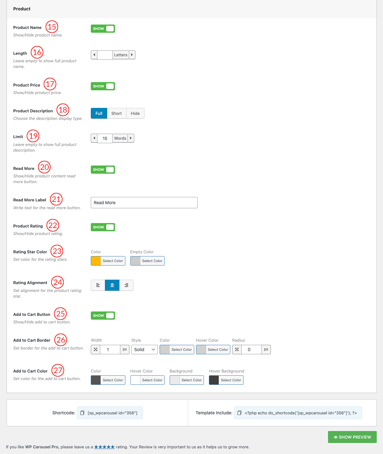
(15) Product Name: You can Show/Hide the Product Name by this option. By default, the Product Name is Shown.
(16) Length: Set product title length in letters. Leave it empty if you want to show the full title.
(17) Product Price: You can Show/Hide the Product Price by this option. By default, the Product Price is set to Show.
(18) Product Description: This is the option you can Show/Hide the Product Description as you wish. By default, the Product Description is Shown.
(19) Limit: You Can set the Product Description Word Limit by this option.
(20) Read More: You can Show/Hide product content Read More button.
(21) Read More Label: Users are also allowed to change the read more button label text as they want.
(22) Product Rating: Show/Hide the product rating.
(23) Rating Star Color: Set the color of product rating stars from here as you wish.
(24) Rating Alignment: Rating Alignment means decorating your product rating in a way that makes a line or row. There are three ways you can set the Star Rating Alignment. Such as:
- Left Alignment: Left Alignment or left justify is formatting that Product Rating star along the left side of the WooCommerce Product Carousel.
- Center Alignment: Center Alignment is formatting that Product Rating star neither the left nor right margin but the center of the WooCommerce Product Carousel.
- Right Alignment: Right Alignment or Right justify is formatting that Product Rating star along the right side of the WooCommerce Product Carousel.
(25) Add to Cart Button: You can Show/Hide the Product Add to Cart Button. By default Add to Cart Button is set to Show.
(26) Add to Cart Border: Set the border for the add to cart button.
(27) Add to Cart Color: Set Add to Cart button Color, Hover Color, Background, Hover Background, Border, Hover Border color as you want.