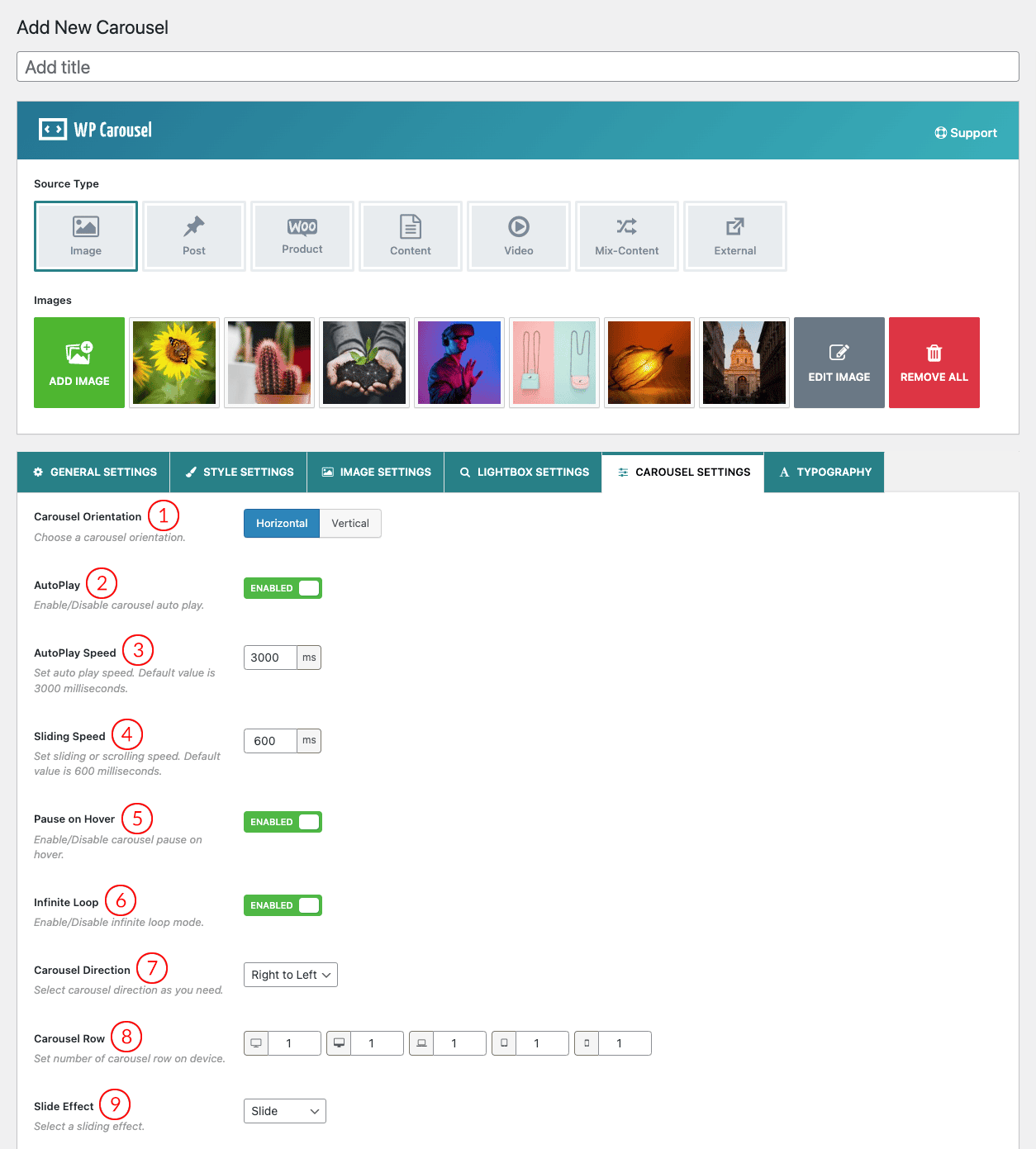
(1) Carousel Orientation: Horizontal and Vertical are the two different carousel orientation options.
(2) AutoPlay: When present, the carousel will automatically start playing as soon as it could do so without stopping. With this feature, you can switch ON/OFF AutoPlay.
(3) AutoPlay Speed: Set auto-play speed. The default value is 3000 milliseconds. 1000 milliseconds is equivalent to 1 second.
(4) Sliding Speed: Set sliding or scrolling speed. The default value is 600 milliseconds.
(5) Pause on hover: Pause slider autoplay on hover. Options are ON and OFF. The default value is ON.
(6) Infinite Loop: If the feature is ON then the slider will run continuously. If you have turned off this feature then the slider loop will stop once the carousel items are completed sliding a loop.
(7) Carousel Direction: There are two types of direction in the plugin. In the RTL mode of the website, if you want to change the direction of the slider then just change the direction from this option.
- Right to Left: The carousel will start sliding Right to Left
- Left to Right: The carousel will start sliding Left to Right
(8) Carousel Row: Set the number of carousel rows for responsive devices.
(9) Slide Effect: A Slide Effect is a visual effect that occurs when you move from one slide to the next. There are two types of slider effects available in the plugin.
- Slide: Slide transition is the effect that takes place between slides when the slide changes into a carousel-like float in from left/right.
- Fade: A “fade” gradually turns the image into black or white and is replaced by the next slider image (It only works in a single-column view).
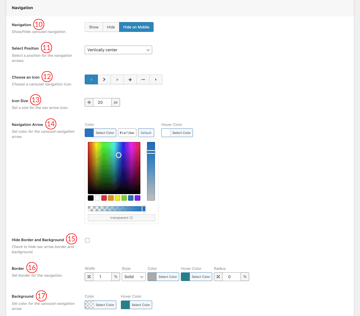
(10) Navigation: Navigation helps users move from one slider image to another. There are three Navigation options.
- Show: Navigation will appear on every device.
- Hide: Navigation will not show on any devices.
- Hide on mobile: Navigation will only hide on mobile devices.
(11) Select Position: Select a Position for the Navigation Arrows. Available Options are:
- Top right
- Top center
- Top left
- Bottom Left
- Bottom center
- Bottom right
- Vertically center
- Vertically center inner
- Vertically center inner on hover
(12) Choose an Icon: You can choose one arrow Icon from 6 different icon styles.
(13) Icon Size: Change the navigation arrow icon size from here.
(14) Navigation Arrow: Set the navigation arrow icon color.
(15) Hide Border and Background: You can Hide/Show the Navigation Icon Border and Background by clicking the option box.
(16) Border: Configure border, border styles, and Border Radius for the carousel navigation as you wish. The default value is 0px.
(17) Background: Set the navigation arrow background color from here.
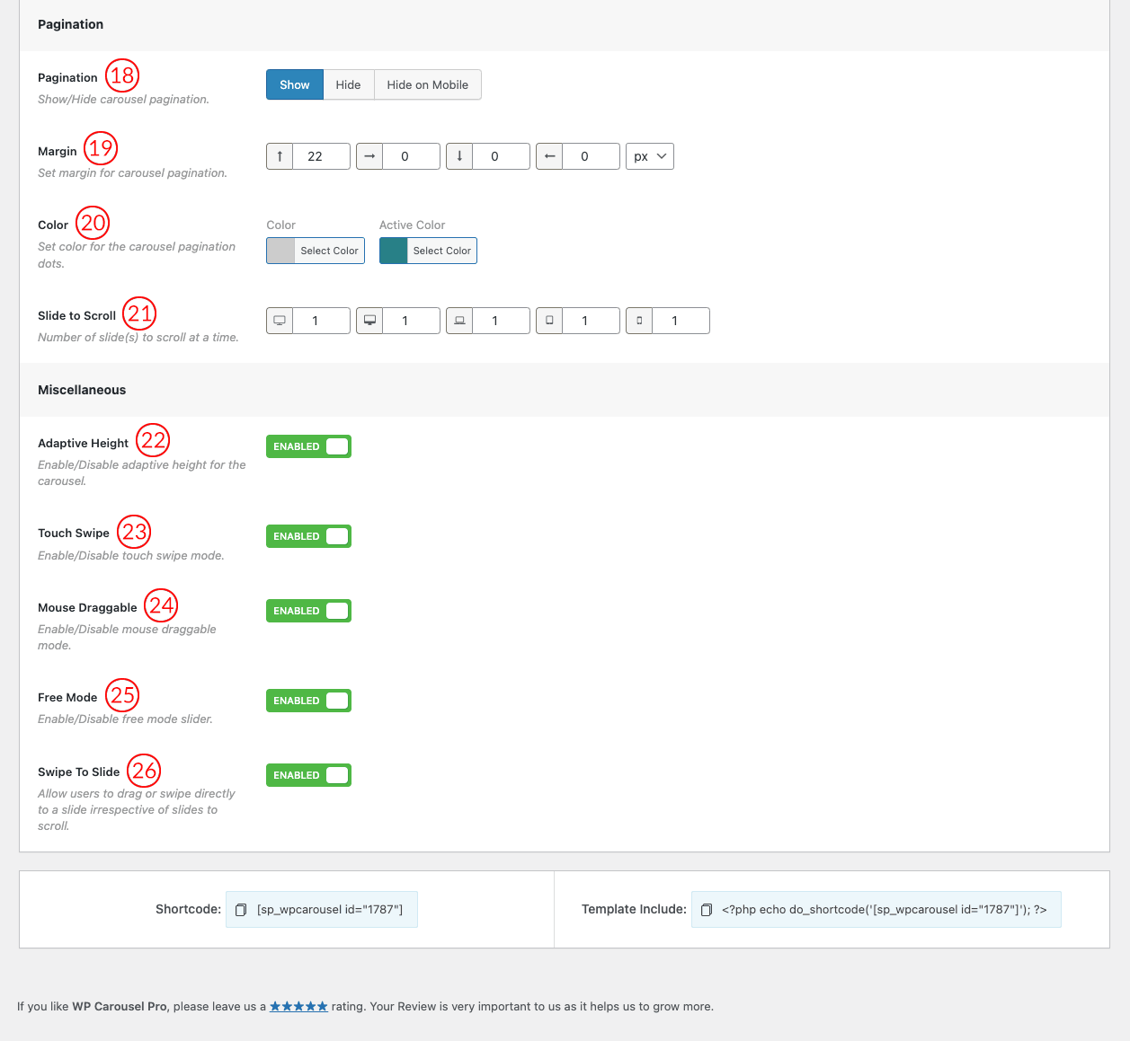
(18) Pagination: Pagination indicates the active item which users see in the Carousel. There are three pagination options.
- Show: Pagination will appear on every device.
- Hide: Pagination will not show on any device.
- Hide on mobile: Pagination will only hide on mobile devices.
(19) Margin: This option refers to the space between the Carousel and the pagination. Set the value as you wish.
(20) Color: Set the color for the carousel pagination dots. You can also set an active pagination dot color.
(21) Slide to Scroll: The option is used to scroll/slide the Number of images at a time on different devices. By default value is “1” for all devices. You can change the value as you want.
(22) Adaptive Height: The plan is to calculate all visible slide items and change the height according to the highest item. If this selection is on/enabled then each slide object will take the automated height in line with its content.
(23) Touch Swipe: Swiping in touch is the act of quick-shifting your finger throughout the touch surface in a certain direction. This feature will be available in the slider after keeping this option ON.
(24) Mouse Draggable: If the option is ON you can move the carousel item by clicking on it with the mouse and dragging it in a certain direction. You are allowed to ON/OFF the option.
(25) Free Mode: This feature allows users to freely scroll and position the slides at any point, rather than being constrained to specific slide positions. Enable/Disable the option from here.
(26) Swipe to Slide: This option permits users to drag or Swipe directly to a slide regardless of the slide to scroll.