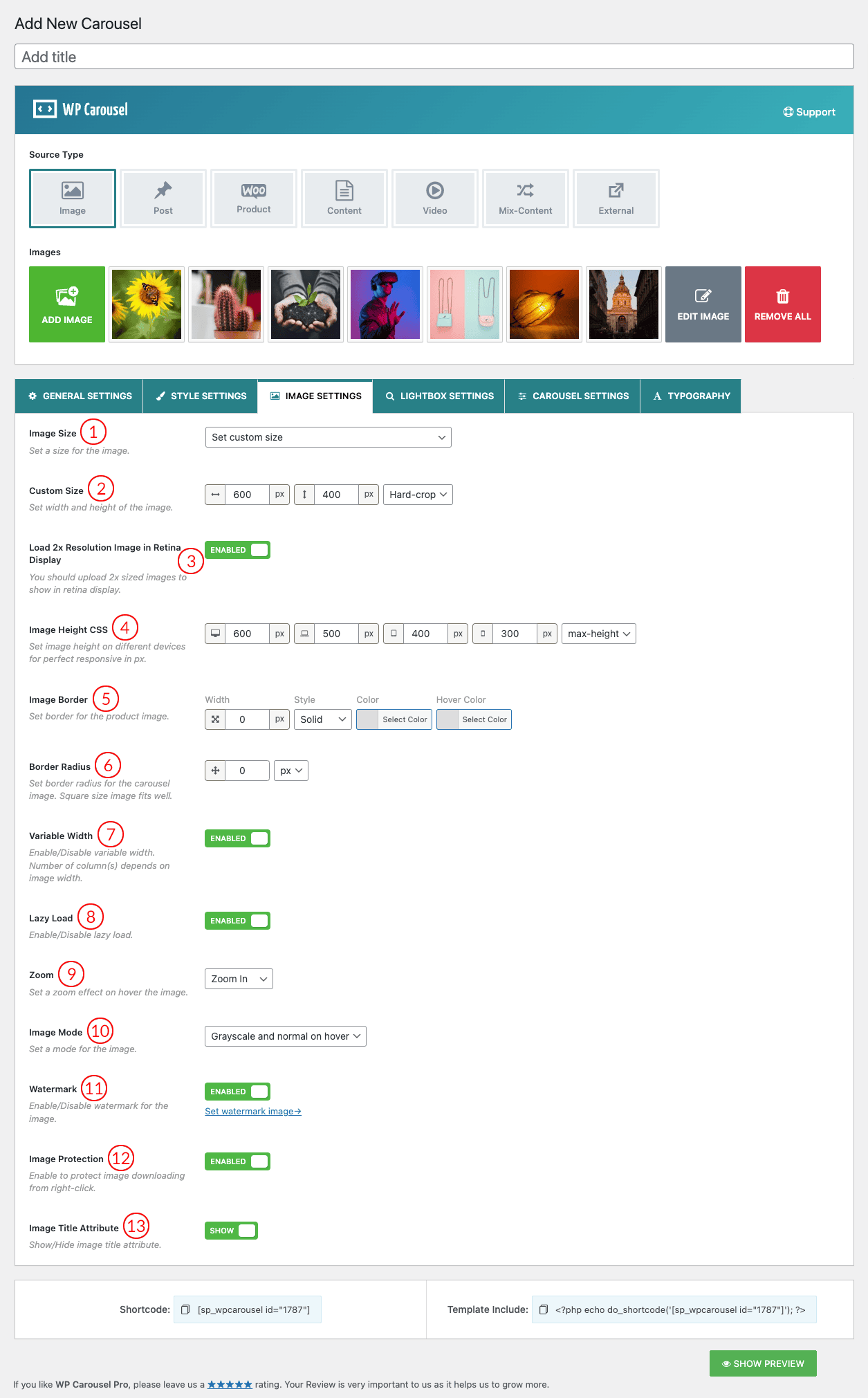
(1) Image Size: Image Size is the term given to describe the height and width of an image in pixels. It will determine how big or small the image is on a page of your site. This option will automatically include all the image sizes your site has. For instance, we are using the twenty-twelve theme that’s why you can see in the options. You can set custom image sizes also. The default value is the original uploaded image.
There will remain different cropping image sizes available in the option to choose from, like below
- Thumbnail – hard: 150 X 150
- Medium – soft: 300 X 300
- Medium_large – soft: 768 X 0
- Large – soft: 1020 X 1024
- Twentyseventeen-featured-image – hard: 2000 X 1200
- Twentyseventeen-thumbnail-avatar – hard: 100 X 100
- Original uploaded image
- Set custom size
(2) Custom Size: This feature allows you to set a custom height and width for your image as you like. You can also select Soft-crop and Hard-crop.
- Soft-crop: The Soft Crop in WordPress is the same as what’s commonly known as a Fit crop and is what we’d normally think of as a pure resize. It’s proportional, so the entire area of the image is retained. The entire image will fit in a box of the dimensions you specify without cutting any of the images. So if the shape of the image is not exactly the same as the shape of the box, you’ll end up with blank space.
- Hard-crop: The hard crop will fill a box of whatever dimensions you specify and cut out any other parts of the image that don’t fit in that box. If you want to create square thumbnails from rectangular images, make the width and height the same. You can set different types of square and rectangular hard crops. It has the property of making sure all the thumbnails are the same shape, which I prefer for its tidiness.
(3) Load 2x Resolution Image in Retina Display: You should upload 2x-sized images to show on the retina display.
(4) Image Height CSS: Image Height is one part of the information that determines a picture, photo, or other image’s dimensions. You can set Image height for different screen sizes to make your site responsive.
(5) Image Border: Set a border for the product image.
(6) Border Radius: Set a Border-Radius for the carousel image. The border fits well in a square size image.
(7) Variable Width: Variable Width specifies the column width for the display of images in the carousel. It does not affect the resolution of the image. If this option is ON the number of the column will be set depending on the column width. The Variable Width Carousel example is given below.

(8) Lazy Load: Lazy loading images means loading images on websites asynchronously — that is, after the above-the-fold content is fully loaded, or even conditionally, only when they appear in the browser’s viewport. This means that if users don’t scroll down, images placed at the bottom of the page won’t even be loaded.
(9) Zoom: This option allows you to move your mouse over a small picture and instantly magnify it, without clicking or opening anything. Available options are as follows:
- Off
- Zoom In
- Zoom Out
(10) Image Mode: Select an image mode from 4 different options. They are-
- Normal: No grayscale effect.
- Grayscale and normal on hover: The image becomes gray but when you hover the image color becomes normal.
- Grayscale on hover: When you hover an image the image will turn gray.
- Always grayscale: The images will be gray all the time.
(11) Watermark: You can set a watermark over the carousel images. Find the related settings in the plugin Settings Menu.
(12) Image Protection: Enable image protection to prevent image downloading from the mouse right-click.
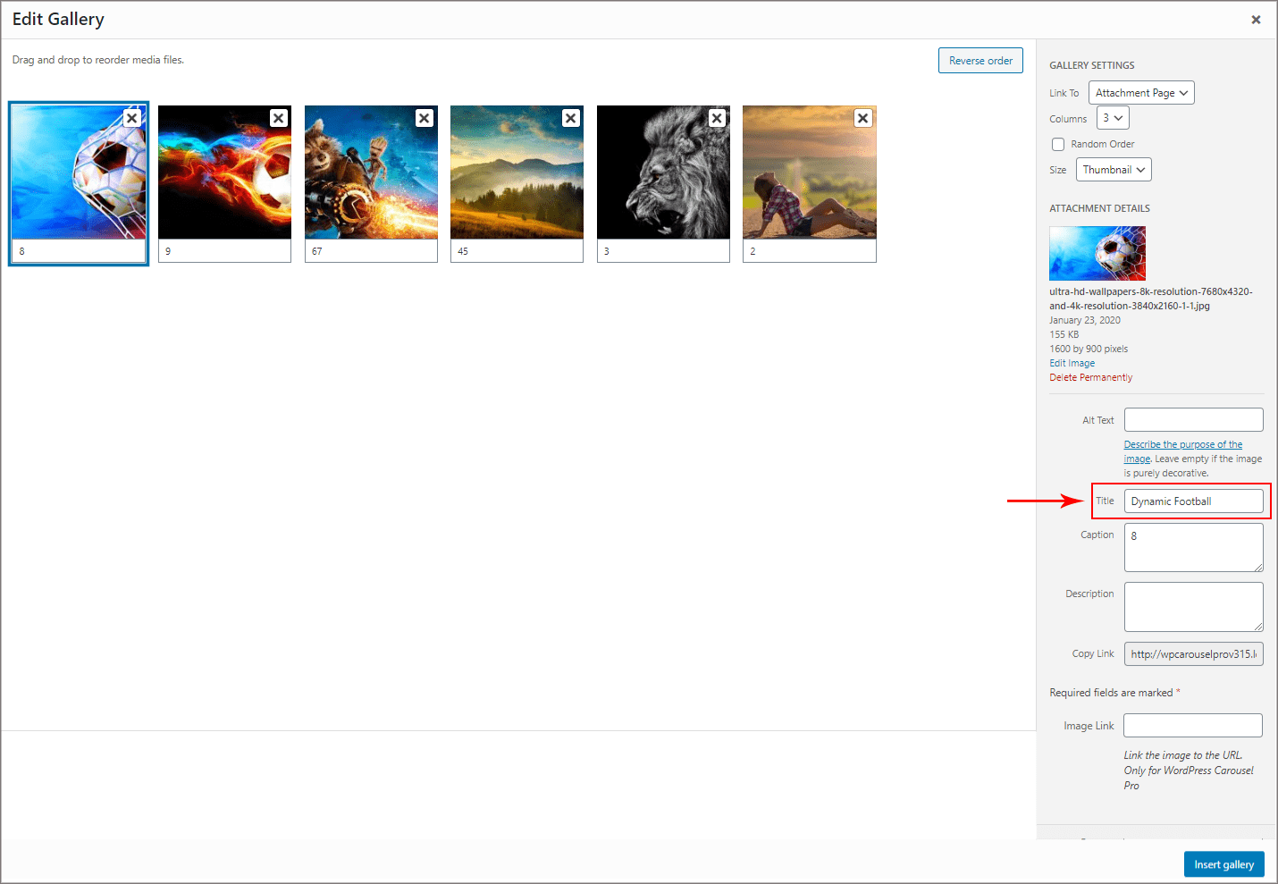
(13) Image Title Attribute: It is used to provide a title for your image. The text you enter inside the title tag will not be shown to the user when an image cannot be displayed. Instead, it is displayed in a popup when a user takes their mouse over to an image. Check the below screenshot and learn how to add an Image Title Attribute and how it looks.

Add Text in the Title section to set an Image Title Attribute.

This is how it is displayed.