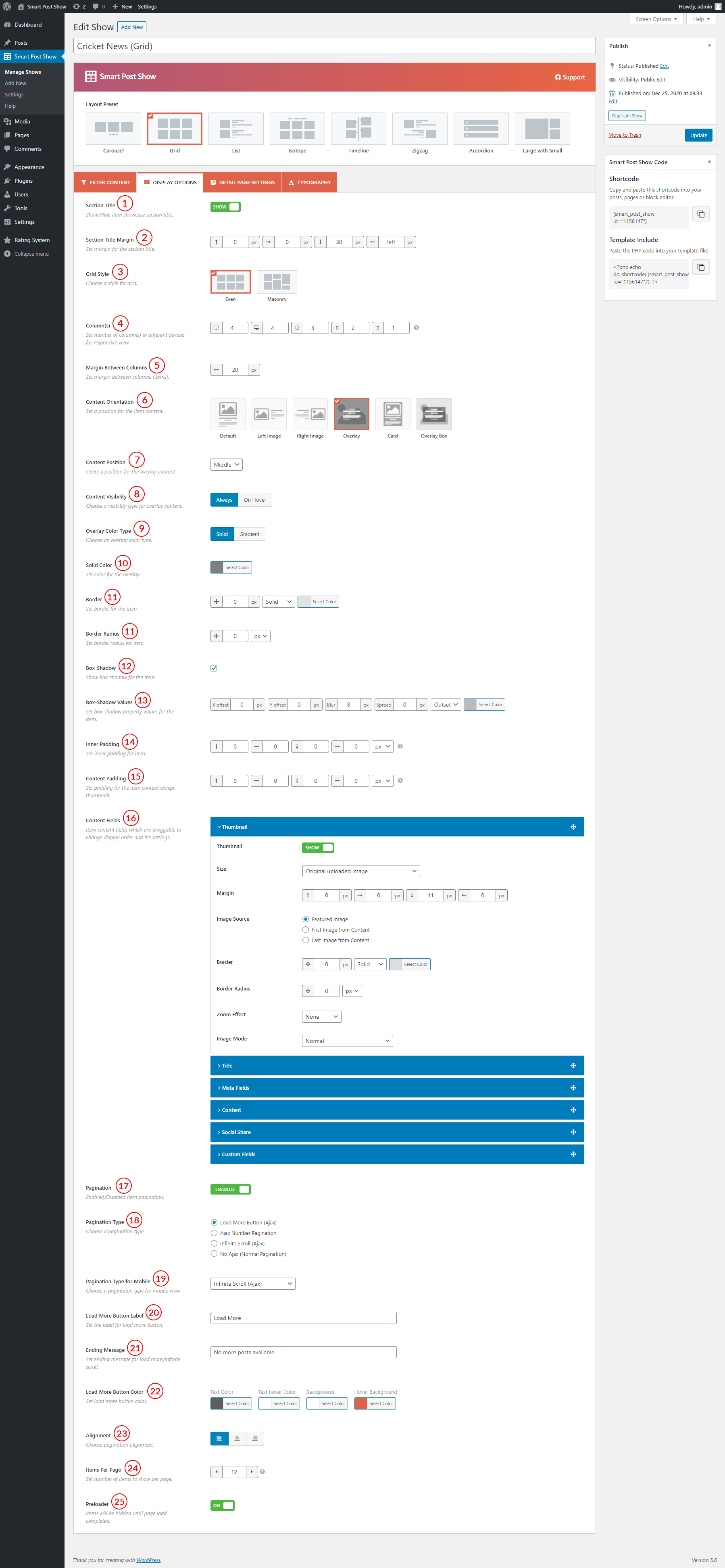
(1) Section Title: Either show or hide post showcase section title. If you turn on this option, the section title will be visible.
(2) Section Title Mirgin: Set the section title margin here.
(3) Grid Style: Select a layout preset from Even and Masonry.
(4) Column(s): Set a different number of columns in different devices for a responsive view. You can set columns number for the following devices-
- Large Size Desktop
- Desktop
- Tablet
- Mobile Landscape
- Mobile
(5) Margin Between Columns: This option allows you to set a margin between two columns. The default value is 20px.
(6) Content Orientation: 6 different content display styles are available. You can display your posts in different styles. Set a position for the post content from the following available content orientations-
- Default
- Left Image
- Right Image
- Overlay
- Card
- Overlay Box
(7) Content Position (Overlay Orientation): Set a content position from the below fields:
- Top
- Middle
- Bottom
(8) Content Visibility (Overlay Orientation): Choose visibility type for overlay content. Available options are:
- Always
- On Hover
(9) Overlay Color Type (Overlay Orientation): Chose an overlay color type from Solid and Gradient.
(10) Solid Color (Overlay Orientation): Set color for the overlay.
(11) Border: You can set the border for each post. You can also style the border with color, border width, and color. The following border styles are available-
- Solid
- Dashed
- Dotted
- Double
- Inset
- Outset
- Groove
- Ridge
- None
(12) Border Radius: Set border radius for each post.
(13) Box-Shadow: This option allows you to enable the box-shadow. If you check this option, it will allow you to set different options for the box-shadow.
(14) Box-Shadow Values: Set box-shadow property values for the post. Different options are available. You can set X & Y Offset, blur, and spread values. You can set box-shadow color and the following two styles are available to set-
- Inside
- Outside
(15) Background: Set background color for the post.
(16) Inner Padding: Inner Padding is the space that’s inside each post between the item and the border. The default value is 0px.
(17) Content Fields: Set content fields that are draggable to change display order and its settings. The following content fields are available to use-
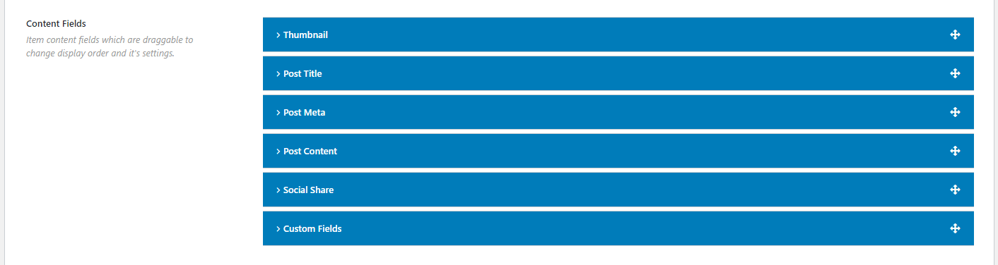
(17.1) Thumbnail: Thumbnail is the featured image of the post. You can either show or hide the thumbnail. If you show it, the following options are available for this post content field-
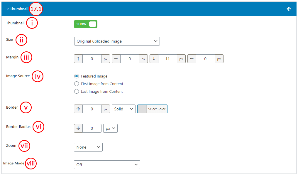
(i) Thumbnail: This option is to Show/Hide the Post thumbnail.
(ii) Size: Set the size of the post thumbnail. You can either set available sizes or custom sizes. If you select custom thumbnail size, you will get the option for custom size. As a result, you can set the custom width and height of the thumbnail images. Also, you will be able to crop images from the right-side options. The following sizes are available to set-
- Thumbnail – hard:150×150
- Medium – soft:300×300
- Medium_large – soft:768×0
- Large – soft:1024×1024
- 1536×1536 – soft:1536X1536
- 2048×2048 – soft:2048X2048
- Original uploaded image
- Set custom size
(iii) Margin: Set margin for post thumbnail. You can set the top, right, bottom, and left margins.
(iv) Image Source: Set the source for the post thumbnail. The following sources are available-
- Featured Image
- First Image from Content
- Last Image from Content
(v) Border: Style the post thumbnail with border width, border style, and border color. The following border styles are available-
- Solid
- Dashed
- Dotted
- Double
- Inset
- Outset
- Groove
- Ridge
- None
(vi) Border Radius: Set the border radius for the post thumbnail. By default, the value is 0px.
(vii) Zoom: Set the animation effect for the post thumbnail. The following animation effects are available-
- None
- Zoom In
- Zoom Out
(viii) Image Mode: Grayscale effects are available to set for post thumbnail. The following grayscale effects are available-
- Off
- Grayscale and normal on hover
- Grayscale on hover
- Always grayscale
(17.2) Post Title: This option allows you to control the post title. You can either hide or show the post title. If you show the post title, you will get the following options for the post title-
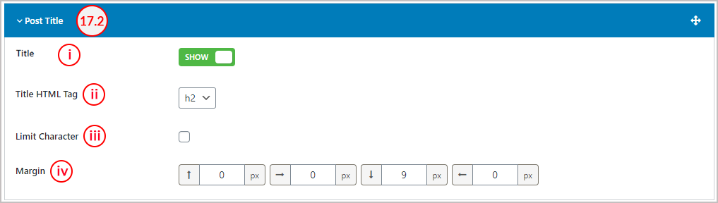
(i) Title: This option is to Show/Hide the Post Title.
(ii) Title HTML Tag: Set the HTML tag for the post title. The following HTML tags are available for the post title-
- h1
- h2
- h3
- h4
- h5
- h6
- p
- div
(iii) Limit Character: You can limit the character of the post title. To set the custom limit for the post title, check this option. If you check this option, you will get the Length option to set a custom limit.
(iv) Margin: Set margin for post thumbnail. You can set the top, right, bottom, and left margins. The default value for the bottom margin is 9px.
(17.3) Post Meta: You can display a number of post meta. Once you click on the Add New Meta button to add a post meta, you will get a selectable field that allows you to select a post meta. The following post meta’s are available to show-
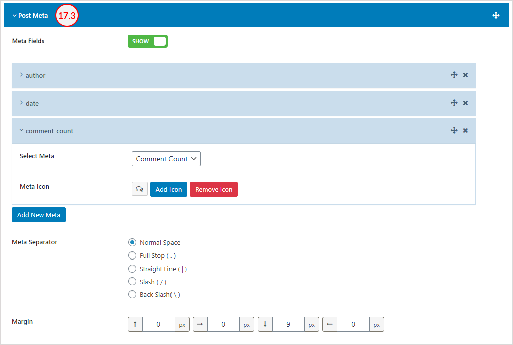
Meta Fields: Show or Hide Meta Fileds.
Author: If you select the author meta, it allows you to select the Meta Icon. Select the meta icon.
Date: If you select the date meta, it allows you to select the Meta Icon. Select the meta icon.
Taxonomy: Select taxonomy. The following taxonomies are available-
- category
- post_tag
- post_category
Now, set the position for the taxonomy. Three different positions are available to set. The positions are-
- Beside Other Meta
- Above Title
- Over Thumbnail
If you select the Above Title taxonomy position, you will get an option named Meta Color that allows you to style the meta with the following color options-
- Color
- Background
If you select the Over Thumbnail taxonomy position, you will get two options named Over Thumbnail Position & Meta Color. The following positions are available for over thumbnail-
- Top Left
- Top Right
- Bottom Left
- Bottom Right
For the meta color, the following color options are available-
- Color
- Background
Comment Count: If you select this meta, it allows you to select the Meta Icon. Select the meta icon.
View Count: If you select this meta, it allows you to select the Meta Icon. Select the meta icon.
Like: If you select this meta, it allows you to select the Meta Icon. Select the meta icon.
Reading Time: If you select this meta, it allows you to select the Meta Icon. Select the meta icon. You will also get the following options-
Per Minute: Set the total words per minute. The default value is 300 words per minute.
- Reading Time Postfix: Set the reading time postfix text. The default label is Min Read.
For all of these post meta, the following options are available to set-
Meta Separator: Select meta separator. The following meta separators are available-
- Normal Space
- Full Stop ( . )
- Straight Line ( | )
- Slash ( / )
- Back Slash ( \ )
Margin: Set margin for post thumbnail. You can set the top, right, bottom, and left margins.
(17.4) Content: You can either show or hide the Post Content. If you show the post content, the following options are available-
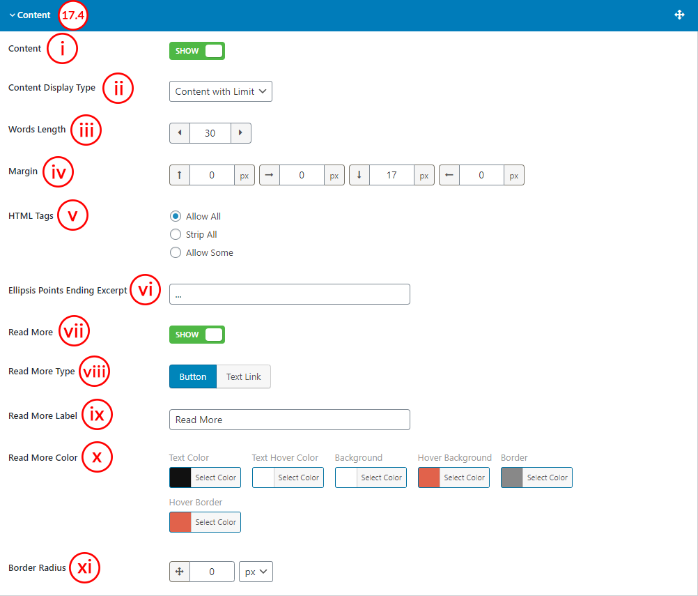
(i) Content: This option is to Show/Hide Post Content.
(ii) Content Display Type: The following three different content display types are available-
- Excerpt
- Content With Limit
- Full Content
(iii) Words Length: If you select the Content with Limit display type, you will see an option named Words Length to set the content character length.
(iv) Margin: Set margin for post thumbnail. You can set the top, right, bottom, and left margins. By default, the bottom margin is 17px.
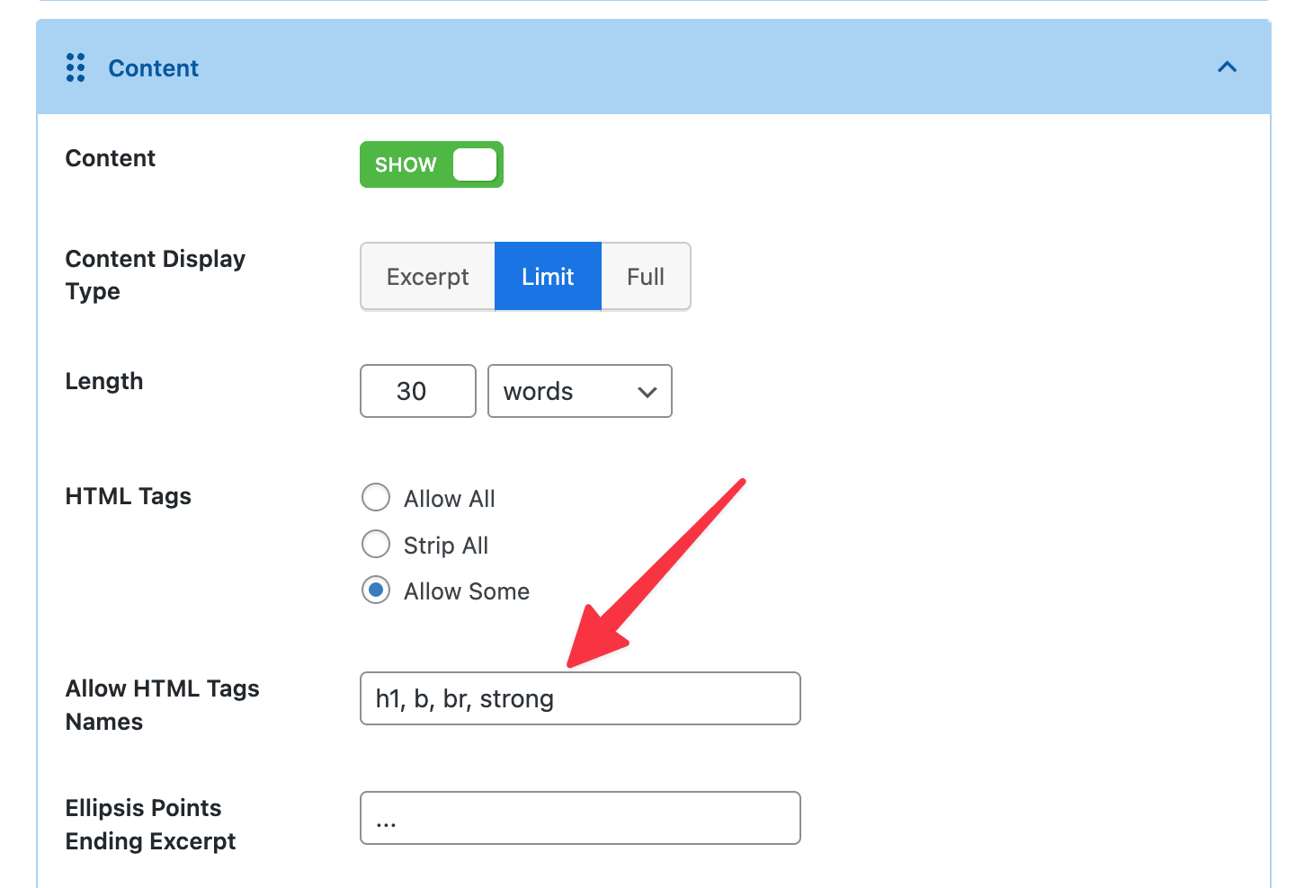
(v) HTML Tags: You can either strip or allow HTML tags. The following options are available for HTML Tags-
- Allow All
- Strip All
- Allow Some
1. Allow All: This option allows all HTML tags in the content. Whatever formatting or HTML elements are used will be displayed as intended.
Example:
If the content is: <p>This is <strong>bold</strong> text.</p>
It will be rendered as: ‘This is bold text.’
2. Strip All: This option removes all HTML tags, showing only plain text. Any HTML code will be stripped completely.
Example:
If the content is: <p>This is <strong>bold</strong> text.</p>
It will be displayed as: ‘This is bold text.’
3. Allow Some: This allows only a few safe HTML tags (like <a> , <b> , <strong> , <i> , <em> , etc.). It’s useful for preserving basic formatting but preventing more complex or potentially unsafe code, like scripts or iframes. You can define which tags you want to allow from the content settings.
Example:
If the content is: <p>This is <strong>bold</strong> and <script>alert("Hello")</script></p>
It might be rendered as: ‘This is bold and’
(The <strong> tag may be preserved, but the <script> tag will be removed for safety.)
(vi) Ellipsis Points Ending Excerpt: Set the ending sign for the excerpt. By default, it is a dotted sign.
(vii) Read More: You can either show or hide the read more option. If you show the read more option, you will see the following options-
(viii) Read More Type: Select the read more type. The following two types are available-
- Button
- Text Link
(ix) Read More Label: Put the label to read more. The default value is Read More.
(x) Read More Color: Style the read more feature with the following options-
- Text Color
- Text Hover Color
- Background ( Button Type only )
- Hover Background ( Button Type only )
- Border ( Button Type only )
- Hover Border ( Button Type only )
(xi) Border Radius: Set Read More Button Border Radius from here.
(17.5) Social Share: You can show the social sharing icons so that visitors can easily share your posts. This feature includes the following options-
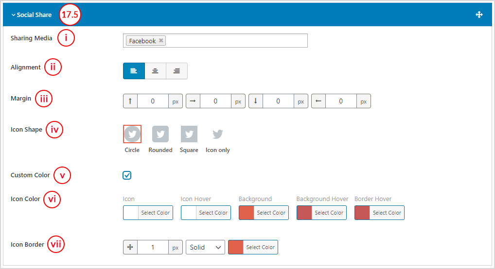
(i) Sharing Media: It is a selectable field. Select social sharing media. Once you select any social media, you will get some more options.
(ii) Alignment: Select the alignment for social media. The following alignments are available-
(iii) Margin: Set margin for post thumbnail. You can set the top, right, bottom, and left margins. By default, the bottom margin is 12px.
(iv) Icon Shape: Select the social media icon shape. The following shapes are available to set-
- Circle
- Rounded
- Square
- Icon only
(v) Custom Color: Check this option if you want to style the social icon with a custom color.
(vi) Icon Color: This option is only visible when you check for the custom color. You can style icon with the following color options-
- Icon
- Icon hover
- Background
- Background hover
- Border hover
(vii) Icon Border: Set icon border and style it with border width, border style, and border color. The following border styles are available-
- Solid
- Dashed
- Dotted
- Double
- Inset
- Outset
- Groove
- Ridge
- None
(17.6) Custom Field: You can show custom information using this feature. Once you click on the Add New Custom Field button, you will get the following options-
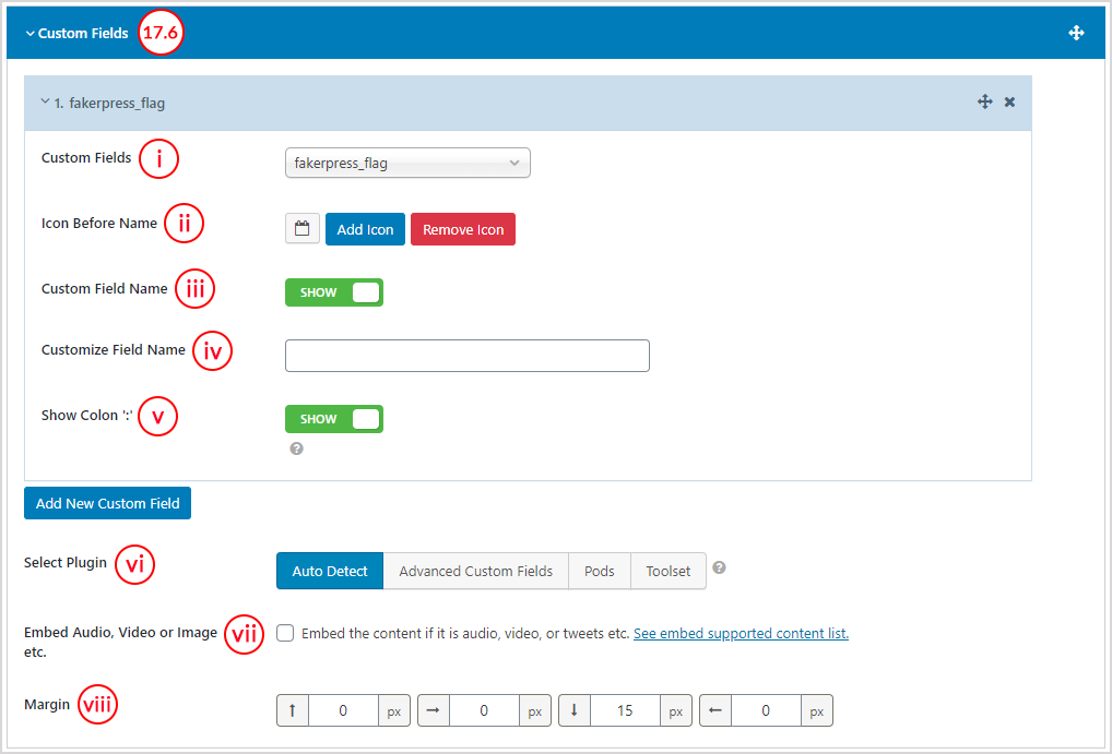
(i) Custom Fields: It shows all available custom fields. Select your expected custom field from here.
(ii) Icon Before Name: you can set an icon before the custom field name.
(iii) Custom Field Name: Either show or hide the custom field name. If you show this, you will get the following options.
(iv) Customize Field Name: Put the field name here.
(v) Show Colon: You can either show or hide the color after the custom field name.
(vi) Select Plugin: Select the plugin which is responsible to create the custom field. The following options are available to select-
- Auto-Detect
- Advanced Custom Fields
- Pods
- Toolset
(vii) Embed Audio, Video or Image, etc: Check if the embed content is audio, video, tweets, etc.
(viii) Margin: Set margin for the custom field. You can set the top, right, bottom, and left margins. By default, the bottom margin is 15px.
(18) Pagination: Either Show or hide the carousel pagination. You can hide the carousel navigation only on a mobile. If you show the carousel pagination, you will get some extra options.
(19) Pagination Type: Choose the type of pagination. The pagination types are available for selection-
(20) Pagination Type for Mobile: Choose the type of pagination for the mobile view. The pagination types are available for selection-
(21) Load More Button Label: Put the label to read more. The default value is Read More.
(22) Ending Message: Set Ending message for load more/infinite scroll.
(23) Read More Color: Style the read more feature with the following options-
- Text Color
- Text Hover Color
- Background
- Hover Background
(24) Alignment: Set the alignment for the pagination. The three alignments are available, e.g: Left, Center, and Right.
(25) Items Per mage: Set how many items you want to show per page. By default, the value is set to 12.
(26) Preloader: If you turn on this option, it will hide the posts until the page load is completed.