Gallery Slider:
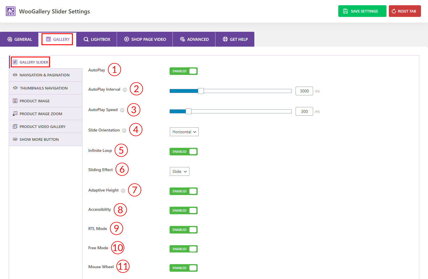
1) AutoPlay: Use the option to Enable/Disable the gallery slider autoplay from here.
2) AutoPlay Interval: Set the autoplay delay or interval time from here. For example, 1000 milliseconds (ms) is equal to 1 second.
3) AutoPlay Speed: Set slider scrolling speed from here. For example, 1000 milliseconds (ms) = 1 second.
4) Slide Orientation: Select any of the slide orientations you want from the dropdown here:
- Horizontal
- Vertical
5) Infinite Loop: Use the option to Enable/Disable the infinite loop of the galley slider.
6) Sliding Effect: Select any of the sliding effects for your gallery slider from 4 different effects:
- Slide
- Fade
- Flip
- Cude
7) Adaptive Height: Enable the option to adjust the height of your gallery images according to the highest item.
8) Accessibility: Enable the accessibility option from here to ensure that everyone, including those with disabilities, can perceive, understand, navigate, and interact with information and functionality of the gallery slider.
9) RTL Mode: RTL or Right-to-Left, is used for languages that are written from right to left, such as Arabic, Hebrew, Urdu, and Persian. Enable/Disable the option from here.
10) Free Mode: Enable the option to navigate the slider images by swiping left or right.
11) Mouse Wheel: Enable the option to navigate the slider images by the mouse wheel.
Navigation and Pagination:
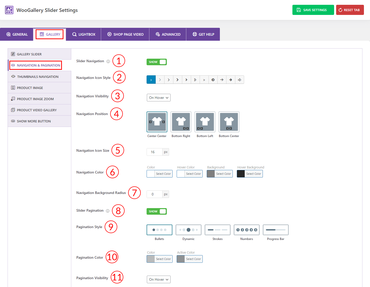
1) Slider Navigation: Use the option to Show/Hide the slider navigation on the gallery slider.
2) Navigation Icon Style: Choose a navigation icon style from here. More than 10 icon styles are available.
3) Navigation Visibility: Select any of the options from the dropdown for navigation visibility from here. Options are:
- Always: Select the option for showing the navigation always.
- On Hover: Select the option for showing the navigation only on hover.
4) Navigation Position: Select the navigation position from 4 different options.
5) Navigation Icon Size: Set the navigation icon size from here as per your need.
6) Navigation Color: Set the navigation icon color, icon hover color, icon background, and icon hover background color from here as you wish.
7) Navigation Background Radius: Set the navigation background radius value as per your need.
8) Slider Pagination: Use the option to Show/Hide the gallery slider pagination from here.
9) Pagination Style: Select the pagination style from 5 different styles.
10) Pagination Color: Set the slider pagination color and active color from here.
11) Pagination Visibility: Select any of the options from the dropdown for pagination visibility from here. Options are:
- Always: Select the option for showing the pagination always.
- On Hover: Select the option for showing the pagination only on hover.
Thumbnails Navigation:
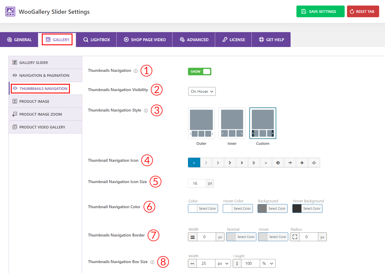
1) Thumbnails Navigation: Use the option to Show/Hide the thumbnail navigation on the gallery slider.
2) Thumbnails Navigation Visibility: Select any of the options from the dropdown for thumbnail navigation visibility from here. Options are:
- Always: Select the option for showing the navigation always.
- On Hover: Select the option for showing the navigation only on hover
3) Thumbnails Navigation Style: Select any thumbnail navigation styles you want from the 3 different styles. Options are:
- Outer
- Inner
- Custom
4) Thumbnail Navigation Icon: Choose a thumbnail navigation icon style from here. More than 10 different icon styles are available.
5) Thumbnail Navigation Icon Size: Set the thumbnail navigation icon size from here as needed.
6) Thumbnail Navigation Color: Set the thumbnail navigation color, icon hover color, background, and hover background color from here as you wish.
7) Thumbnails Navigation Border: Set a thumbnail navigation border width, normal color, hover color, and border radius from here.
8) Thumbnails Navigation Box Size: Set the Height and Width values as you want in (pixels) or (%) or (em).
Product Image:
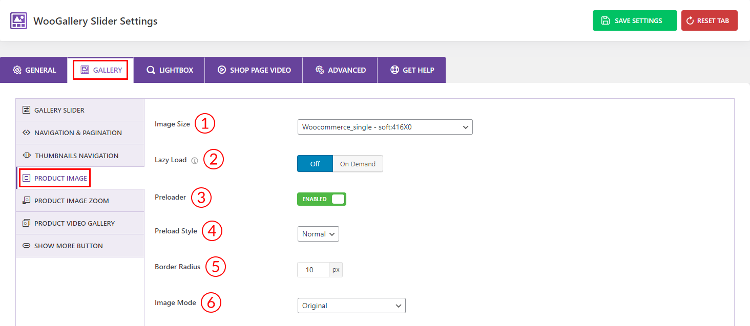
1) Image Size: Select any predefined image size for your product image from here. You can also set a custom size for your product image.
2) Lazy Load: Select Off or On Demand as you prefer for the lazy load option.
3) Preloader: Enable/Disable the preloader option from here.
4) Preload Style: Select any of the preload styles from 4 four different styles from the dropdown.
- Normal
- Fade
- Gray
- Blur
5) Border Radius: Set a border radius for your product gallery image from here if you like.
6) Image Mode: Select any of the image modes you prefer from the dropdown here. There are 5 different modes available:
- Original
- Grayscale
- Grayscale on hover
- Grayscale with active normal
- Active grayscale with normal
Product Image Zoom:
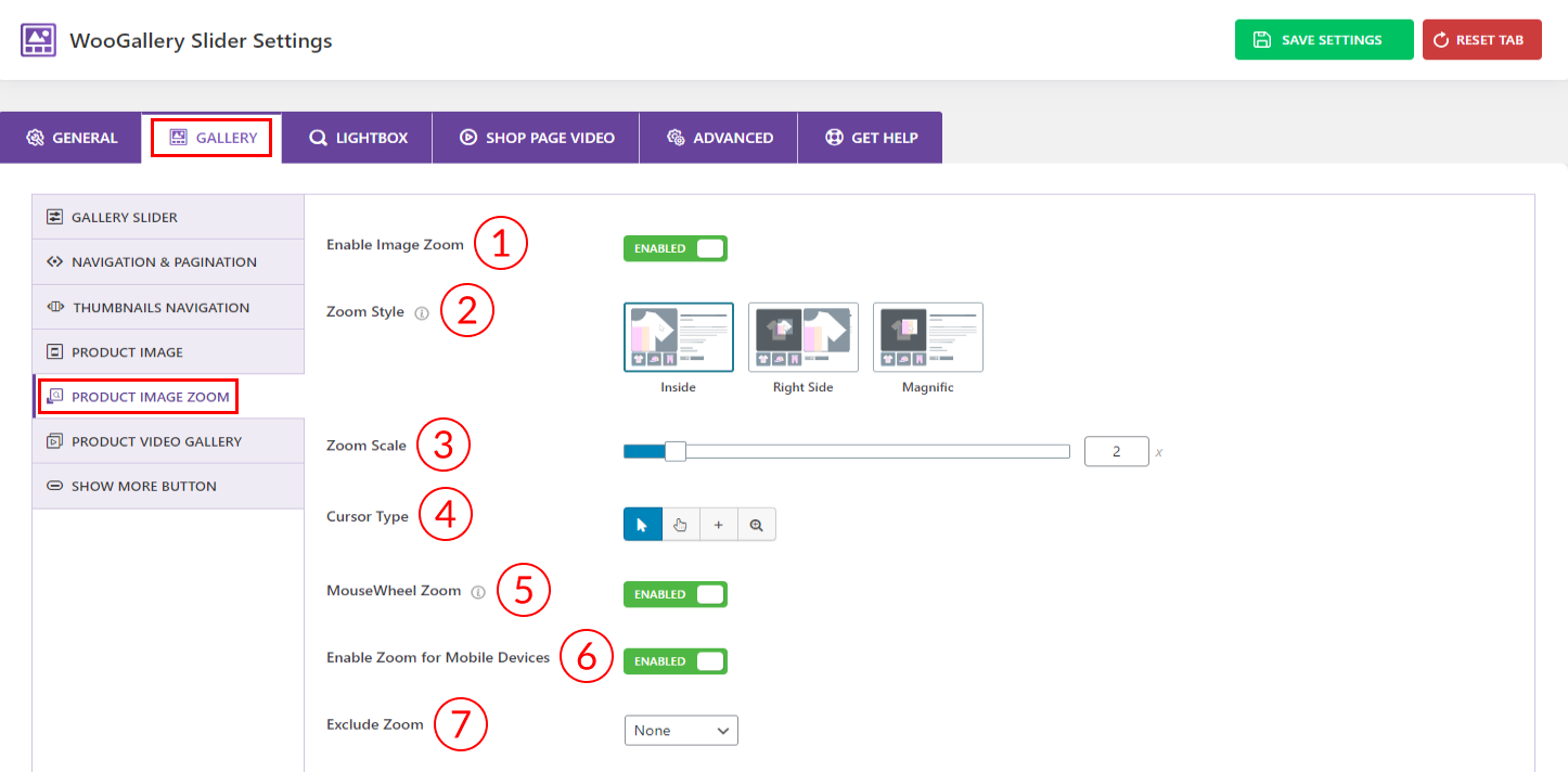
1) Enable Image Zoom: Use the option to Enable/Disable the image zoom feature from here.
2) Zoom Style: Select any zoom styles for your product images. Available options are:
- Right Side
- Inside
- Magnific
3) Zoom Scale: Set the gallery image zoom scale as you want in percentage.
4) Cursor Type: Select any of the cursor types you want from 4 different types.
5) MouseWheel Zoom: Use the option to Enable/Disable the mouse wheel zoom for your product gallery images.
6) Enable Zoom for Mobile Devices: Use the option to Enable/Disable the zoom feature for mobile devices.
7) Exclude Zoom: Select Product(s) or Category(s) to exclude Zoom from the Single Product Page or Category Page.
Product Video Gallery:
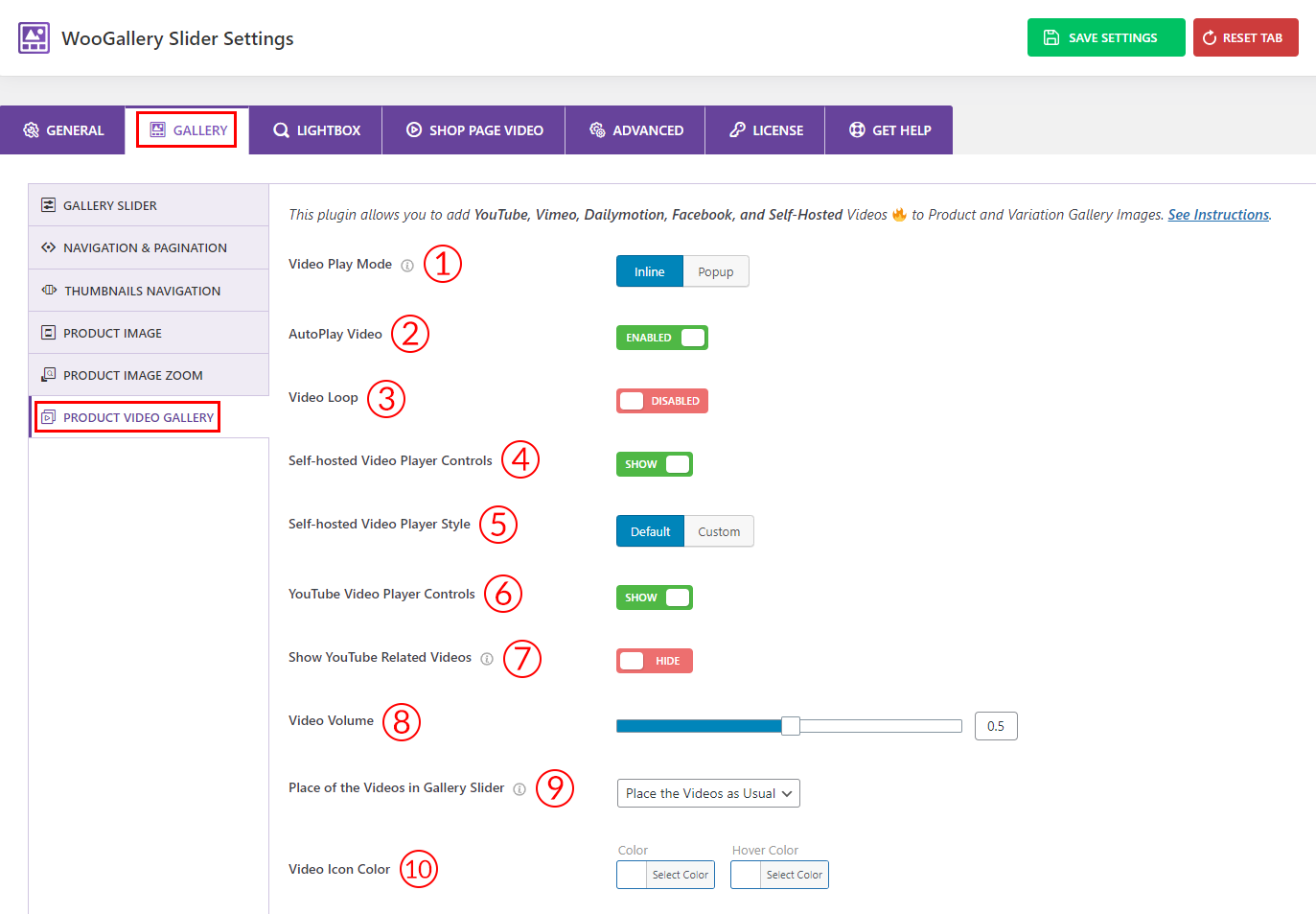
1) Video Play Mode: Select any video play mode for your product videos from here. 2 types of video play modes are available:
- Inline
- Popup
2) AutoPlay Video: Use the option to Enable/Disable the autoplay of the videos.
3) Video Loop: Use the option to Enable/Disable the video loop.
4) Self-hosted Video Player Controls: Use the option to Show/Hide the self-hosted video player controls.
5) Self-hosted Video Player Style: Select any of the video player styles for the self-hosted videos from here. Options are:
- Default
- Custom
6) YouTube Video Player Controls: Use the option to Show/Hide the YouTube video player controls from here.
7) Show YouTube-Related Videos: Use the option to Show/Hide the YouTube-related videos at the end of the video.
8) Video Volume: Set the video volume as you want from here.
9) Place of the Videos in Gallery Slider: Select any options from the dropdown to place the videos in the gallery slider. Options are:
- At Starting of the Slider
- End of the Slider
- Place the Videos as Usual
10) Video Icon Color: Select the video icon color and hover color from here as you wish.
Show More Button:
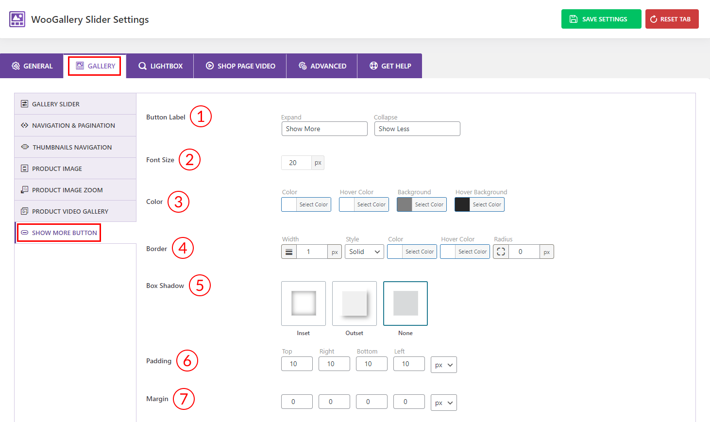
1) Button Label: You can edit the button label as you wish for the Gird and Hierarchy Grid layout.
2) Font Size: Set the Show More button font size as per your need from here.
3) Color: Set the Show More button Color, Hover Color, Background, and Hover Background color as you wish.
4) Border: Set the border width, style, color, and border radius as per your need from here.
5) Box Shadow: Select any of the box shadow options you want from here.
6) Padding: Set paddings for the Show More button as you want in different units like (px, %, em).
7) Margin: Set the margin values as you want for the Show More button.