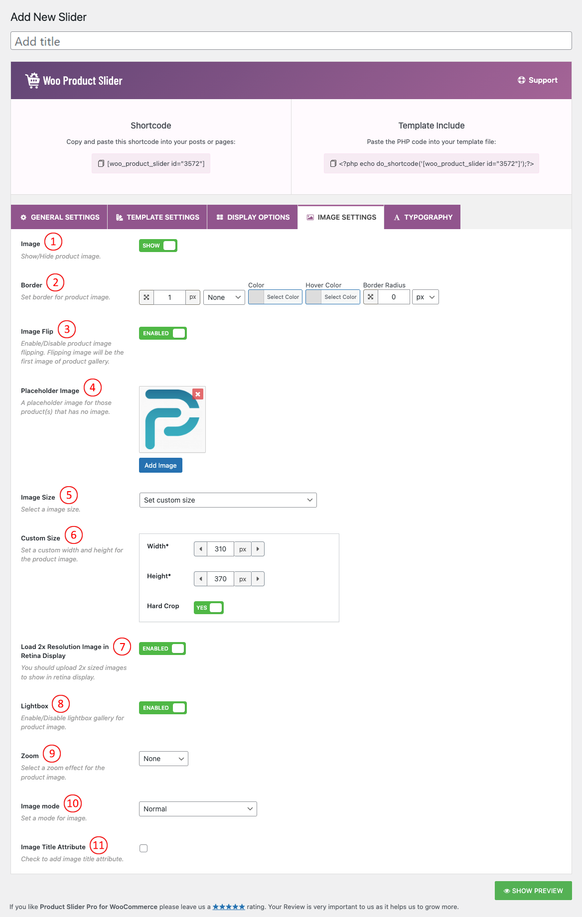
(1) Image: You can Show/Hide the Product image by selecting SHOW and HIDE from this option.
(2) Border: Set border for product image.
(3) Image Flip: Image Flip adds a flip effect to your WooCommerce product thumbnail images. It takes the first image from the gallery and uses it as a second image for the product. When a user hovers over an image, the second image will show.
(4) Place Holder Image: Set a Place Holder image for those which has no product image.
(5) Image Size: Image Size is the term given to describe the height and width of an image in pixels. It will determine how big or small the image is on a page of your site. This option will automatically include all the image sizes your site has. You can set custom image sizes also. The default value is the original uploaded image.
There will be different image cropping sizes available in the select option, like below:
- Thumbnail – hard: 150 x 150
- Medium – soft: 300 x 300
- Medium_large – soft: 768 x 0
- Large – soft: 1020 x 1024
- 1536X1536 – soft: 1536X1536
- 2048X2048 – soft: 2048X2048
- Woocommerce_thumbnail – hard: 324X324
- Woocommerce_single – soft: 416X0
- Woocommerce_gallery_thumbnail – hard: 100X100
- Shop_catalog – hard: 324X324
- Shop_single – soft: 416X0
- Shop_Thumbnail – hard: 100 X 100
- Original uploaded image
- Set Custom Size
(6) Custom Size: Set a custom width and height for the product image.
(7) Load 2x Resolution Image in Retina Display: You should upload 2x-sized images to show on the retina display.
(8) Lightbox: Lightbox is a popup overlaying window that shows the original size of the Product image when clicked on it. By default, this option is turned OFF.
(9) Zoom: Select a zoom effect for the product image.
(10) Image mode: Set a mode for the image.
- Off: No grayscale effect.
- Gray with normal on hover: The Product Slider becomes gray but when you hover the Product, the color becomes normal as it is.
- Gray on hover: When you hover over a Product the Product will turn gray.
- Always gray: The Product Slider will be gray all the time.
(11) Image Title Attribute: It is used to provide a title for your image. The text you enter inside the title tag will not be shown to the user when an image cannot be displayed. Instead, it is displayed as a popup when a user takes their mouse over to an image. Check if you want to enable this option.