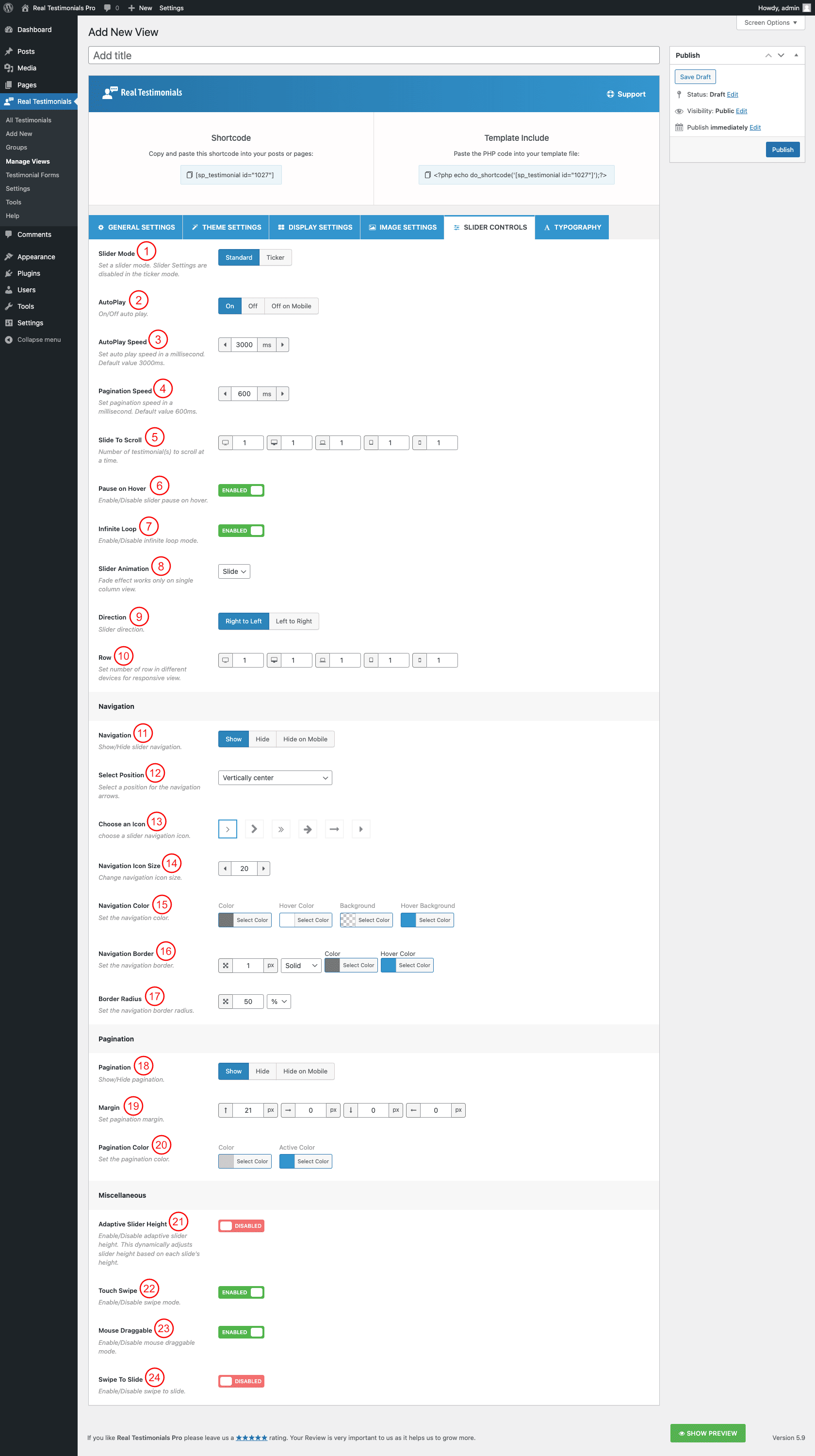
(1) Slider Mode: Select slider mode. The following two different slider modes are available to use.
- Standard
- Ticker ( If you select the ticker mode, the Carousel Controls will be disabled )
(2) AutoPlay: You can either turn on or off the autoplay feature for the carousel. You can also hide the autoplay on mobile separately. If you turn on the autoplay, you will get the following options to set autoplay speed:
(3) AutoPlay Speed: Set the speed value for the autoplay. The default value is 3000ms.
(4) Pagination Speed: Set pagination speed in a millisecond. The default value is 600ms.
(5) Slide to Scroll: Set the total number of testimonials to slide per scroll. The default value is 1 testimonial per scroll.
(6) Pause on Hover: Turn on or off this option. If you turn on this option, it will stop the carousel from playing once users hover on the carousel. By default, this option is turned on.
(7) Infinite Loop: Infinite loop allows you to navigate the carousel items continuously without moving backward at the end of carousel items. You can turn on or off this feature. By default, this option is turned on.
(8) Slider Animation: Select the slider animation. The following animations are available-
- Slide
- Fade ( works only on single column view )
(9) Direction: Select slider direction to slide. The following directions are available to set-
- RTL ( slide from right to left )
- LTR ( slider from left to right )
(10) Row: Set the number of rows in different devices for responsive view. The following devices are available to set the items-
- Large Desktop
- Desktop
- Laptop
- Tablet
- Mobile
(11) Navigation: Show or hide the slider navigation. You can hide the slider navigation only on a mobile. If you show the slider navigation, you will get some extra options.
(12) Select Position: Select a position for the navigation arrows. The following nine different positions are available-
- Top right
- Top center
- Top left
- Bottom left
- Bottom center
- Bottom right
- Vertically center outer
- Vertically center inner
- Vertically center inner on hover
(13) Choose an Icon: Choose an icon for slider navigation. Six different icons are available for use.
(14) Navigation Icon Size: Increase or decrease the navigation icon size as you like.
(15) Navigation Color: You can style the carousel navigation with the following available style options-
- Color
- Hover Color
- Background
- Hover Background
- Border
- Hover BorderNavigation Color: You can style the carousel navigation with the following available style options-
- Color
- Hover Color
- Background
- Hover Background
- Border
- Hover Border
(16) Navigation Border: Set navigation border. You can also style the border with border width, border color, border hover color, and different border styles. The following border styles are available to set-
- Solid
- Dashed
- Dotted
- Double
- Inset
- Outset
- Groove
- Ridge
- None
(17) Border Radius: Set the navigation border radius.
(18) Pagination: Either Show or Hide the slider pagination. You can hide the slider navigation only on a mobile. If you show the slider pagination, you will get some extra options.
(19) Margin: Set margin for the slider pagination. You can set margins for left, right, top, and bottom. The margin unit is in px. The default value for the top is 21px.
(20) Pagination Color: Set the pagination color. The following color options are available for pagination-
- Color
- Active Color
(21) Adaptive Carousel Height: Enable this option to dynamically adjust post carousel height based on each slide’s height.
(22) Touch Swipe: Either turn On or Off touch-swipe mode.
(23) Mouse Draggable: Turn On or Off mouse draggable mode. If you turn on it, it allows you to navigate the slider items with dragging.
(24) Swipe to Slide: Either turn On or Off the swipe to slide option.