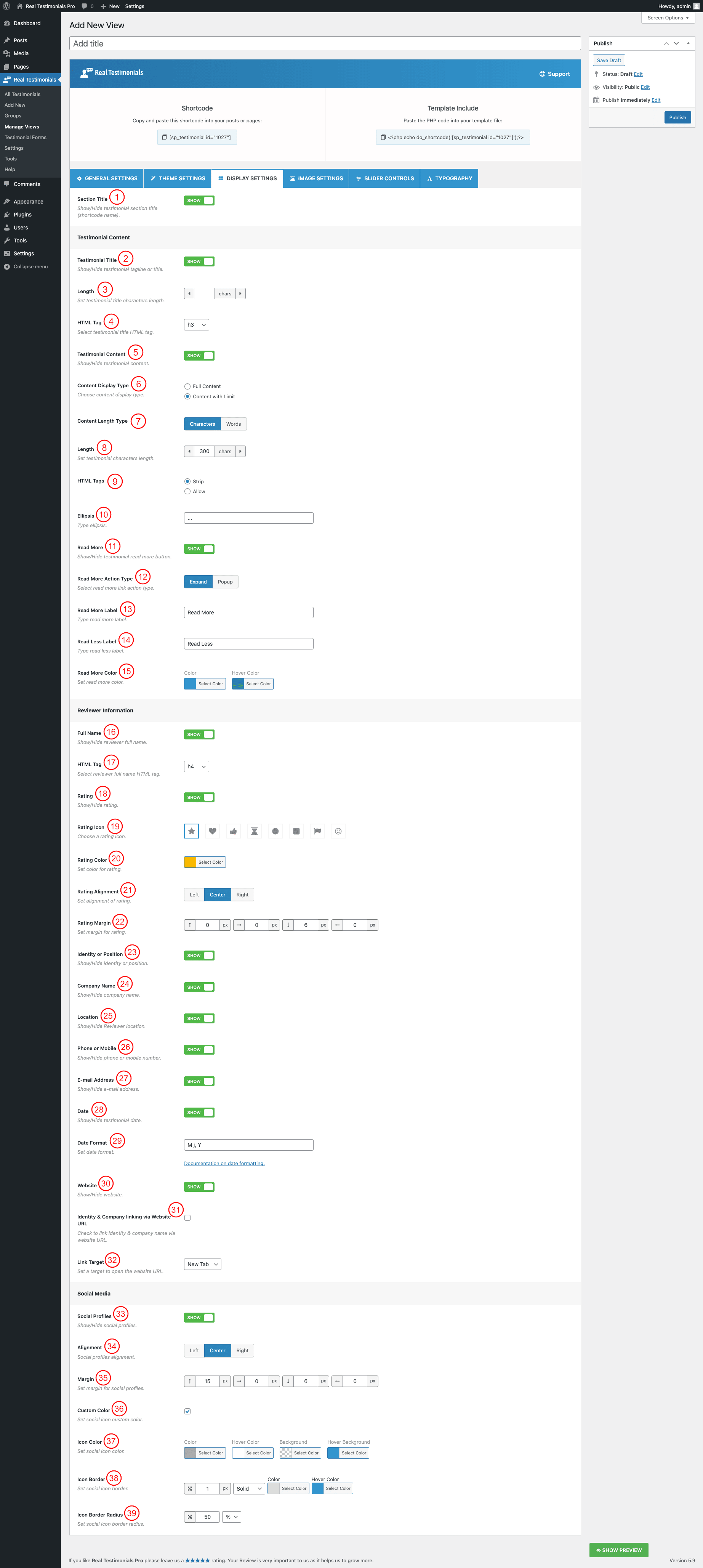
(1) Section Title: You can either show or hide the testimonial section title.
(2) Testimonial Title: You can either show or hide the testimonial tagline or title.
(3) Length: Set testimonial title length character.
(4) HTML Tag: Set the HTML tag for the testimonial title or tagline. The following HTML tags are available to set-
- h1
- h2
- h3
- h4
- h5
- h6
- p
- span
- div
(5) Testimonial Content: You can either show or hide the testimonial content.
(6) Content Display Type: This option allows you to show either the full content or a limited character of the testimonial. Available Options are-
- Full content
- Content with limit
(7) Content-Length Type: When you select the Content display type as Content with Limit then the following Content-Length Type option will appear. This option allows you to set the testimonial content limit in two different types and they are:
- Character
- Words
(8) Length: Set testimonial character length. The default value is 300 characters.
(9) HTML Tags: You can Strip or Allow the HTML tags of the Testimonial Content.
(10) Ellipsis: Set the ellipsis sign. This symbol will be visible after the limited characters. You can type the testimonial Ellipsis as you like.
(11) Read More: You can either show or hide the read more button below the testimonial content.
(12) Read More Action Type: You can set the read more action type in two different ways. They are Expand or Popup.
(13) Read More Label: You can rename the read more label. By default, the label text is Read More.
(14) Read Less Label: If you select Expand type read more action, you will get this option that allows you to rename the read less label. The default label text is Read Less.
(15) Read More Color: Style the read more link with the following color options.
- Color
- Hover Color
(16) Full Name: This option allows you to either hide or show the reviewer’s full name. If you show the reviewer’s name, you will get the following option to set the tag for the reviewer’s name.
(17) HTML Tag: Set the HTML tag for the reviewer full name. The following HTML tags are available to set-
- h1
- h2
- h3
- h4
- h5
- h6
- p
- span
- Div
(18) Rating: Either hide or show the reviewer rating. If you turn on this option to show the rating, you will get the following options to style it.
(19) Rating Icon: Select rating icon. 8 different icons are available to set for rating.
(20) Rating Color: Style the rating icon with this option. It allows you to set the rating icon color.
(21) Rating Alignment: Set the alignment for the rating icon. The following alignments are available to set-
- Left
- Center
- Right
(22) Rating Margin: Set margin for the rating container. You can set margins for left, right, top, and bottom.
(23) Identity or Position: Use this option to either show or hide the identity or position of the reviewer.
(24) Company Name: Use this option to either show or hide the company name of the reviewer.
(25) Location: Use this option to either show or hide the location of the reviewer.
(26) Phone or Mobile: Use this option to either show or hide the phone or mobile number of the reviewer.
(27) E-mail Address: Use this option to either show or hide the E-mail address of the reviewer.
(28) Date: You can either hide or show the date of the testimonial publishing using this option. If you show the date, you will get the following option to set the format of the date-
(29) Date Format: Set the date format. You can follow the link in this option description to get an idea about the date format.
(30) Website: Use this option to either show or hide the website of the reviewer.
(31) Identity & Company linking via Website URL: Check this option to link the reviewer’s identity and company name with the website URL.
(32) Link Target: Set the website link target behavior. The following target behaviors are available to set-
- New Tab
- Same Tab
(33) Social Profiles: This option allows you to either hide or show the social profiles for the reviewer. If you show the social profiles, you will see the following options to configure the social icons-
(34) Alignment: Set social profiles alignment. The following alignments are available to set-
- Left
- Center
- Right
(35) Margin: Set margin for the social profiles. You can set margins for left, right, top, and bottom. The margin unit is in px.
(36) Custom Color: You can override the default social icon color and set a custom color for them. Check this option if you want to set custom colors. Once you check it, the following color options will be available to set colors-
(37) Icon Color: Set the social icon custom color, hover color, background color, and Hover background color.
(38) Icon Border: Set a border around the social icon in px.
(39) Icon Border Radius: Set a social icon border radius. The default value is 50%.