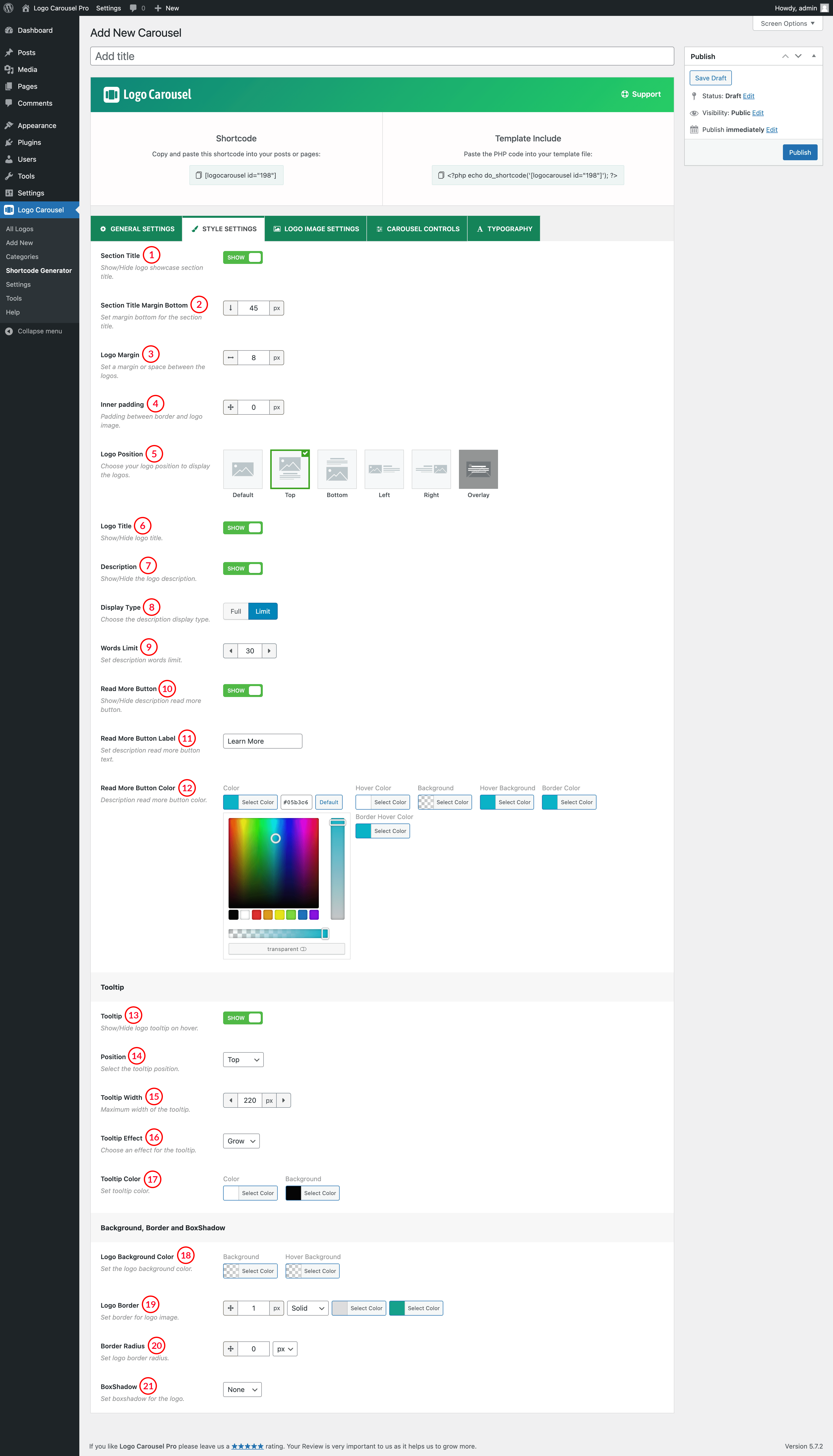
(1) Section Title: You can control the display of the Carousel Section Title by this option.Set ON to show Title or set OFF if you don’t want to show the title.
(2) Section Title Margin Bottom: This Attribute is to set the Bottom Margin of Section Title. The default value for Section Title Bottom Margin is set to 45px. You can change the value as you like.
(3) Logo Margin: Set Margin Between the Logos inside the carousel. Default Margin Between Logos is 8px. You can set the value as you wish.
(4) Inner Padding: Inner Padding is the space that’s inside the carousel item between the Logos and the border. The default Inner Padding value is 0px.
(5) Logo Position: Select a Position for Logo Title. Options are:
A. Default: The logos will show in their default position.

B. Top: The title will be shown at the top of the Logo.

C. Bottom: The title will be shown at the bottom of the Logo.

D. Left: The logo will be shown at the left of the title and description.

E. Right: The logo will be shown at the left of the title and description.

F. Overlay: Title will be shown on overlay when you hover over a logo.


(6) Logo Title: You can display or Hide the Logo Title by clicking ON and OFF.
(7) Description: Select ON/OFF to Show or Hide Logo Description.
(8 Display Type: Choose How you want to display your description. Options are:
- Full: Full Description will be shown.
- Limit: You can set the word limit for the description and also you can set the Learn More button for the rest description. Choose Learn More Button Color.
(9) Words Limit: Number of words to show as the Logo Description. The default value for Description Word Count is 30 Words.
(10) Read More Button: Show/Hide Description Load More button by turning ON/OFF from this option.
(11) Read More Button Label: Users are also allowed to change the Read More Button level text as they like.
(12) Read More Button Color: Set Read More Button Color, Hover Color, Background, Hover Background, Border Color, Border Hover Color.
(13) Tooltip: When the user hovers the pointer over an item, without clicking it and a tooltip may appear- a small “hover box” with information about the item being hovered over.
(14) Position: Select a Tooltip position from:
A. Top: Tooltip will appear at the top of logos.
B. Bottom: Tooltip will appear at the Bottom of logos.
C. Left: Tooltip will appear on the Left of logos.
E. Right: Tooltip will appear in the Right of logos.
(15) Tooltip Width: Set Tooltip width as you want. Default Tooltip width is set to 220px.
(16) Tooltip Effect: There are five different Tooltip Effects for you. Choose among:
- Grow
- Fade
- Swing
- Slide
- Fall
(17) Tooltip color: This option is used to set Tooltip Color and d Background Color.
(18) Logo Background Color: Set Logo Background Color and Hover Color from this option.
(19) Logo Border: Set Border for Logo Images. You can set the border width, style, color, and hover color here.
(20) Border Radius: Set a Border-Radius for the Logo carousel image. Border fits well in a square size image. The Default value of Border Radius is 0px.
(21) Box-shadow: The Box-shadow CSS property adds shadow effects around an element’s frame. Available options for box shadows are:
- Off: No box-shadow will appear.
- Inset: Inset shadows are drawn inside the border (even transparent ones) above the background but below the content.
- OutSet: The shadow will appear outside the border.