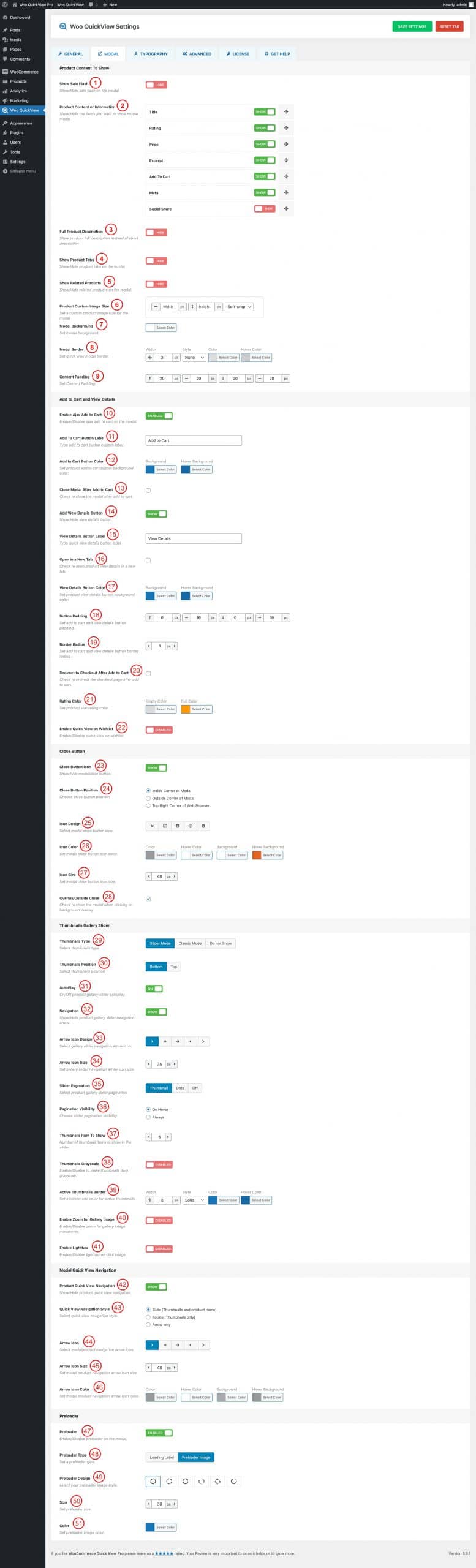
(1) Show Sale Flash: Show or Hide the Sale Flash on the modal.
(2) Product Content or Information: Show or hide the field that you want to display in the modal. Available Fields to show in the quick view are,
- Title
- Rating
- Price
- Excerpt
- Add To Cart
- Meta
- Social Share
(N:B: You can order the fields as you like by doing drag and drop)
(3) Full Product Description: Show or Hide the product’s full description instead of the short description.
(4) Show Product Tabs: Show or hide the product tabs on the modal.
(5) Show Related Products: Show or hide the related products on the modal.
(6) Product Custom Image Size: Set a custom product image size for the modal.
(7) Modal Background: Change the modal background color as you like.
(8) Modal Border: You can set a modal border, border style, color, and hover color.
(9) Content Padding: Set a modal content padding from here.
(10) Enable Ajax Add to Cart: Enable or Disable the Ajax add to cart button on the modal.
(11) Add to Cart Button label: Type the add to cart button label as you like.
(12) Add to Cart Button Color: Change the add to cart button background and hover background color as per your need.
(13) Close Modal After Add to Cart: Check the box if you want to close the modal after adding a product to the cart.
(14) Add View Details Button: Show or hide the View Details button in the popup.
(15) View Details Button Label: When you show the view details button you can change the view details button label.
(16) Open In a New Tab: Check the box to open the product details page in a new tab.
(17) View Details Button Color: Change the view details button background color and hover color from here.
(18) Button Padding: Set add to cart and view details button padding as you like.
(19) Border Radius: Set add to cart and view details button border-radius from here.
(20) Redirect to Checkout After Add to Cart: Check the box if you want to redirect the user to the checkout page after adding a product to the cart.
(21) Rating Color: Change the rating empty color and full color from here.
(22) Enable Quick View on Wishlist: Enable or disable the quick view on the wishlist.
(23) Close Button Icon: Show or hide the modal close button icon.
(24) Close Button Position: Choose a close button position from three different options. They are:
- Inside Corner of Modal
- Outside Corner of Modal
- Top Right Corner of Web Browser
(25) Icon Design: Select a modal close button icon from five different icon styles.
(26) Icon Color: Set modal close button Icon color, Hover Color, Background, and Hover Background.
(27) Icon Size: Set modal close button Icon size from here. By default, the icon size is set to 40px.
(28) Overlay/Outside Close: Check the box if you want to allow the users to close the modal by clicking on the background overlay.
(29) Thumbnails Type: Select a Thumbnails type. Available options are:
- Sider Mode
- Classic Mode
- Do not Show
(30) Thumbnails Position: Select a thumbnails position in between the bottom or top.
(31) Autoplay: Turn ON or OFF the product gallery Slider autoplay.
(32) Navigation: Show or Hide Product gallery Slider Navigation Arrow.
(33) Arrow Icon Design: Select a gallery slider navigation arrow icon.
(34) Arrow Icon Size: Change the gallery slider navigation arrow icon size as you like.
(35) Slider Pagination: Select a product gallery slider pagination from Thumbnails, Dots, and Off.
(36) Pagination Visibility: Set how you want to display the slider paginations. You can either set On Hover or Always.
(37) Thumbnails Item to Show: Set the number of thumbnails you want to show in the slider. By default, only 6 thumbnails show in the gallery.
(38) Thumbnails Grayscale: Enable or disable to make the thumbnails item grayscale.
(39) Active Thumbnail Border: Set border, border style, color, and Hover color of the active thumbnail.
(40) Enable Zoom For Gallery Image: Enable or Disable the Zoom for gallery images on mouseover.
(41) Enable Lightbox: Enable or Disable the lightbox on click image.
(42) Product Quick View Navigation: Show or Hide the product quick view navigation from here.
(43) Quick View Navigation Style: Select a quick view navigation style form:
- Slide (Thumbnail and Product name)
- Rotate ( Thumbnails Only)
- Arrow Only
(44) Arrow Icon: Select modal navigation arrow icon from different icon sets.
(45) Arrow Icon Sze: Set modal product navigation arrow icon size.
(46) Arrow Icon Color: Change the arrow icon color, hover color, background, and background color as you like.
(47) Preloader: Enable or Disable the preloader on the modal.
(48) Preloader type: Select a preloader type from Loading Label or Preloader Image.
(49) Preloader Design: Select a preloader image from 6 different image styles.
(50) Size: Set preloader image or label size from here.
(51) Color: Change the preloader image color as you like.