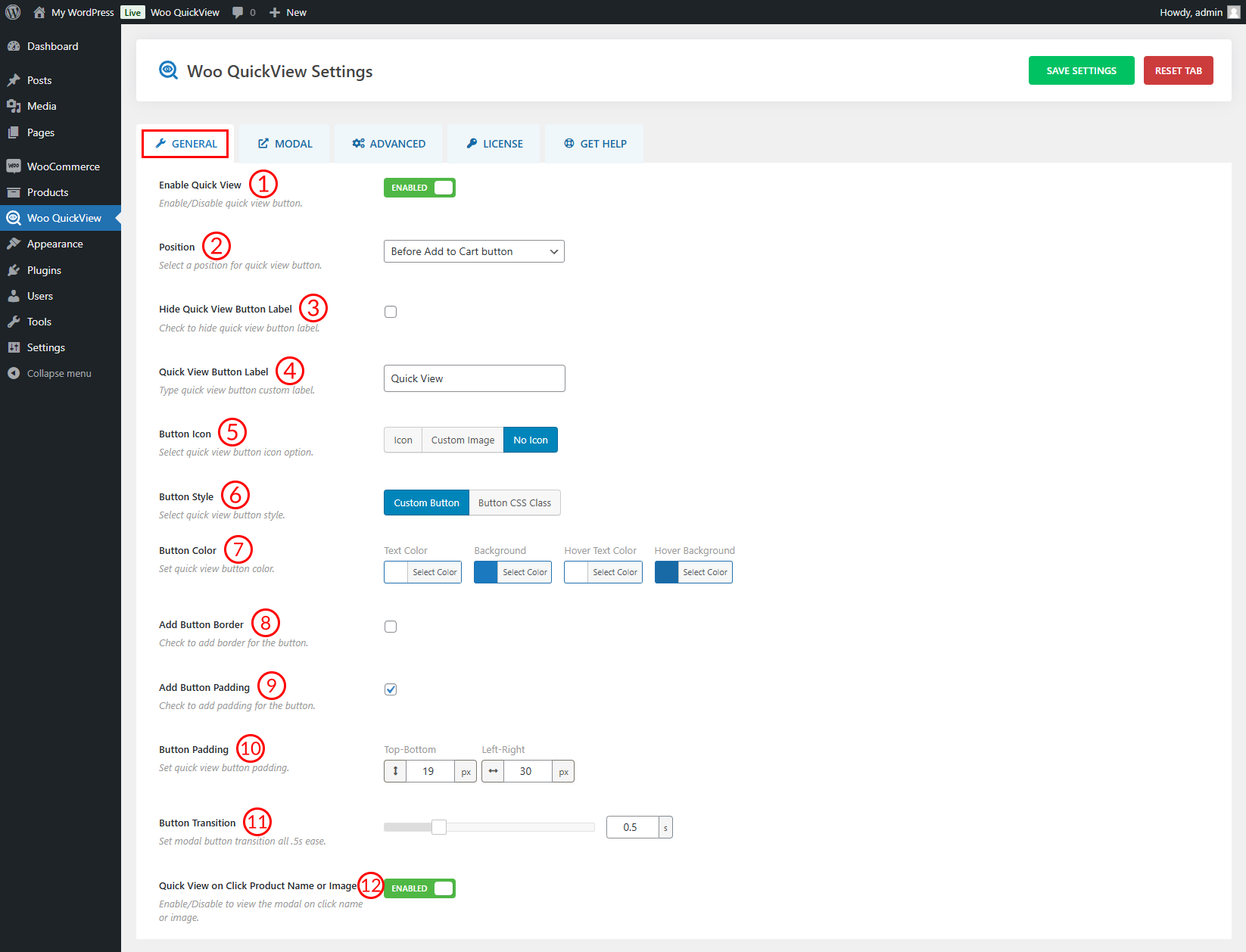
(1) Enable Quick View: Enable or Disable the quick view button from here.
(2) Layout: Select a quick view layout from 4 different options and they are:
- Left Image
- Right Image
- Top Image
- Bottom Image
(3) Modal Effect: Set a quick view of Modal Effect from here. Available options are:
- Move From Top
- Fade
- Zoom In
- Zoom Out
- Newspaper
- Move Horizontal
- 3D Unfold
- Slide Bottom
(4) Modal Size: Set maximum width and height for the Modal. This option is only available for the Left and Right image Layout.
(5) Image and Content Area Width: Distribute the space between the product image and content in a reciprocal manner.
(6) Modal Overlay Background: Set a Modal Overlay Background color as you like.
(7) Quick View Button Position: You can show the quick view button almost everywhere in the product catalog. Select a Quick View Button Position where you want to show it. Options are:
- Before Add to Cart Button
- After Add to Cart Button
- Above Add to Cart Button
- Below Add to Cart Button
- Below Product Image
- Above Product Image
- Below Product Title
- Below Product Price
- Over Product Container on hover
- Over Product image on hover
(8) Button Style: Set a quick view Button Style from Custom Button or Button CSS Class. When you select the Custom button then you will have all the options to customize the button. On the other hand, if you select Button CSS Class then you can add a custom class to the quick view button and then modify the button styling as you like.
(9) Button Color: Configure the button color, hover color, background, and hover background color as you like.
(10) Button Border: Set button border width, style, color, and hover color from here.
(11) Border Radius: Set border radius for the quick view button in pixels (px) or percentage (%).
(12) Button Padding: You are allowed to adjust the button padding as per your need.
(13) Button Transition: Set how fast you want to popup the quick view once you click the button. The default transition time is set to 0.5 sec.
(14) Button Icon: Select a quick view button icon option. Available Features are:
- Icon
- Custom Image
- No Icon
(15) Button Icon Design: Select a button icon from 9 different designs.
(16) Icon Size: Set the quick view button Icon size from here. By default, the Icon size is set to 30px.
(17) Hide Quick View Button Label: Check the box if you want to hide the quick view button label.
(18) Quick View Button Label: Type a quick view button custom label here.
(19) Quick View on Click Product Name or Image: Enable the option if you want to view the popup by clicking the product image or name.