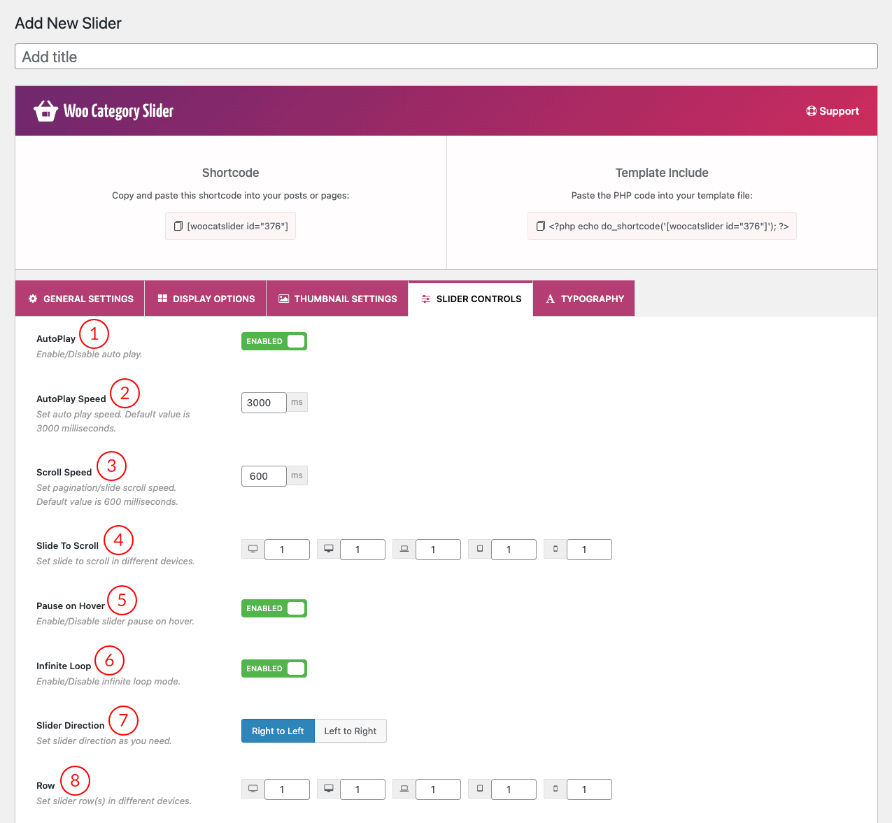
FYI: This Slider Controls Settings tab is only applicable to the Slider Layout of the plugin. Otherwise, this tab will hide from the tab settings menu of the plugin.

(1) AutoPlay: This button is used for turning on/off the autoplay feature.
(2) AutoPlay Speed: Also, you can specify the time to spend on a slide before advancing to the next. The default value is 3000 milliseconds. You can change this default value as you want.
(3) Scroll Speed: Set pagination/slide scroll speed. The default value is 600 milliseconds.
(4) Slide to Scroll: Set how many slider items you want to scroll at a time. You can set the value for responsive devices.
(5) Pause on Hover: Turn on or off the pause on hover as you like.
(6) Infinite Loop: This is an awesome feature of the slide. If this feature is ‘ON’ then all slides will loop continuously. If you have turned off this feature then the slider loop will stop after once.
(7) Slider Direction: There are two types of direction in the slider. In the RTL mode of the website, if you want to change the direction of the slider then just change the direction from this option.
- Right to Left
- Left to Right
(8) Row: If you want to create a multi-row slider then use this option to set the row value for responsive devices.

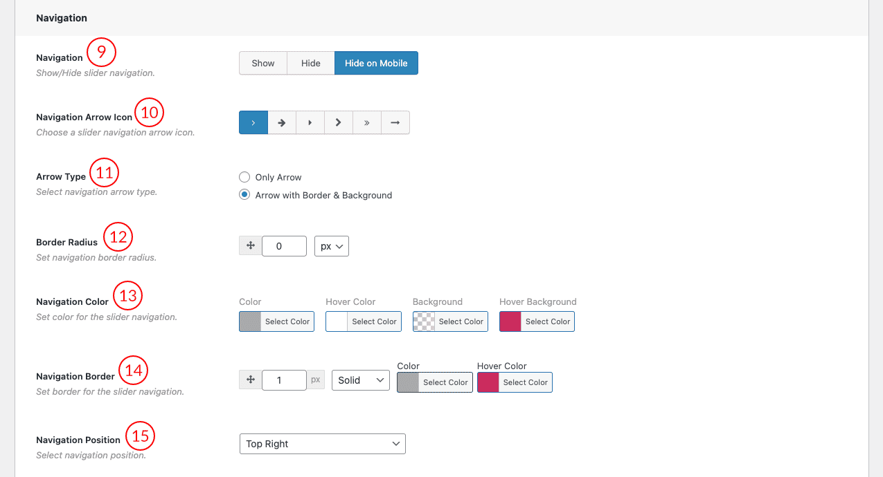
(9) Navigation: Select an option for navigation of the slider. There are three navigation options.
- Show
- Hide
- Hide on Mobile
(10) Navigation Arrow Icon: You can choose one arrow style from 6 arrow icon styles.

(11) Arrow Type: There are two options to select and set the navigation arrow type.
- Only Arrow
- Arrow with Border & Background
(12) Border Radius: Set navigation border radius in px or % values.
(13) Navigation Color: Set the color for the slider navigation in normal mode and hover mode.
(14) Navigation Border: Set the navigation border with a style and choose a color for it. There are some styles for the border.
- Solid
- Dashed
- Dotted
- Double
- Inset
- Outset
- Groove
- Ridge
- None
(15) Navigation Position: Select a navigation position for the navigation arrow in the slider. There are four positions available.
- Top Right
- Vertical Center Inner
- Vertical Center Outer
- Vertical Center Inner on Hover

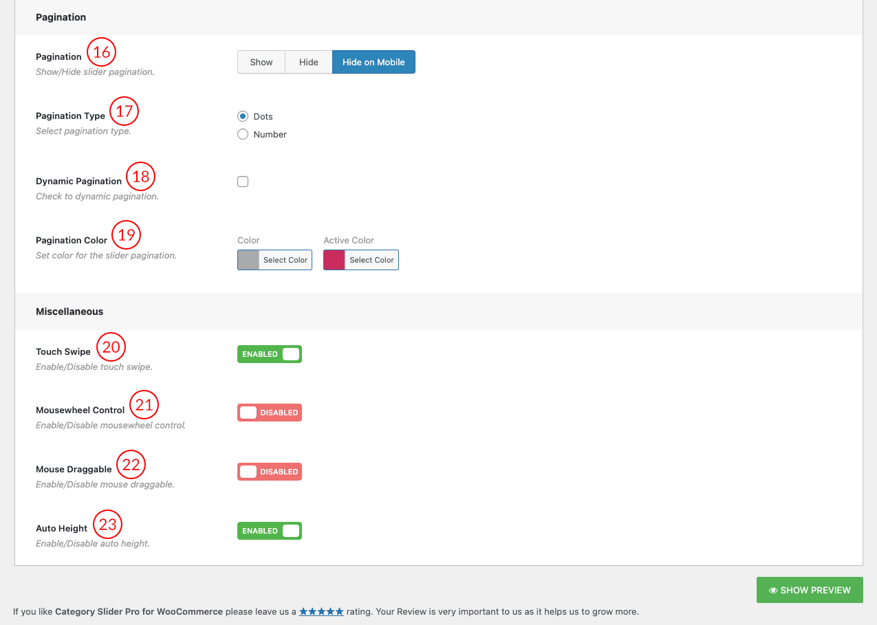
(16) Pagination: Pagination is an essential part of any content-rich website, such as a magazine or a blog with a slider. With slider pagination, we can reach any slide quickly by just clicking the handle.
(17) Pagination Type: In the pagination section, there are two types of pagination in the plugin.
- Dots
- Number
(18) Dynamic Pagination: The Dynamic Pagination component will automatically calculate the sliders depending on the given options. This is a useful list view, where you need to trigger an event to load new items dynamically. Checkmark this field to get the dynamic pagination feature on the slider.
(19) Pagination Color: You can change the color and the active color for the dynamic pagination from this option.
(20) Touch Swipe: Swiping in touch is the act of quickly moving your finger across the touch surface in a certain direction. This feature will be available in the slider after keeping this option ON.
(21) Mousewheel Control: When the option is enabled you can control the slider with the mouse wheel.
(22) Mouse Draggable: Enable the option to move the slider next to the previous item by mouse dragging.
(23) Auto Height: The plan is to calculate all visible slide items and change the height according to the highest item. If this option is on/enabled then each slide item will take the automatic height according to its content.