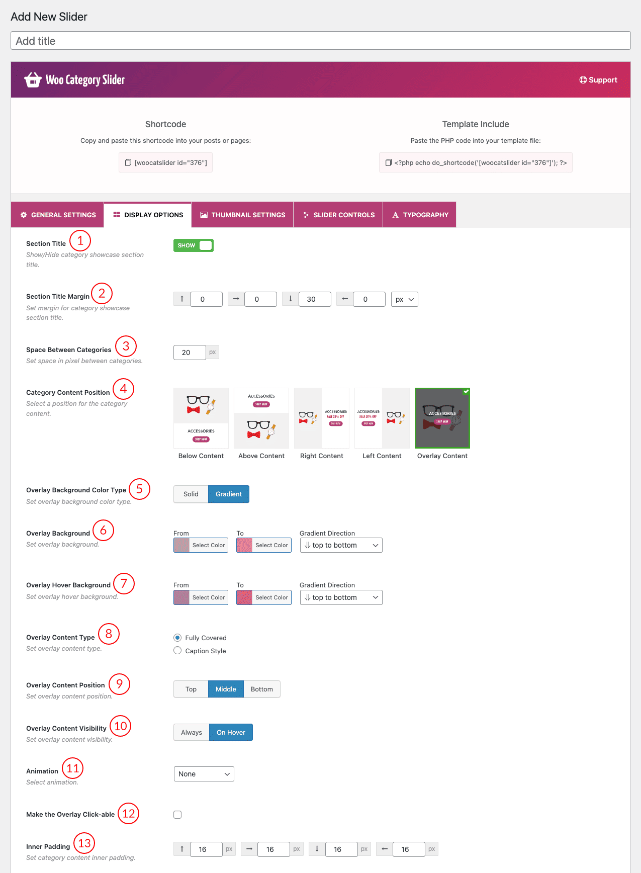
(1) Section Title: This option controls the Section title show/hide in the carousel. By default, it shows the section title in the carousel. If you want to hide the carousel section title, then you can hide it by using this button.
(2) Margin from Section Title: Set the margin for the category slider section title in the carousel. Only a 30px margin at the bottom of the section title is set by default. You can set margins for the left, right, and top of the section title. Also, you can change the margin value unit (px/em) from the last field of this option.
(3) Space Between Categories: By default, 20px space is set between the categories in the slider. The user has the freedom to increase/decrease the space between the categories from this option.
(4) Category Content Position: There are five positions to display category content in the category slider. Click on a position image to select the category content position in the category slider. Below content is selected as the default position for showing category content.
- Below Content: Category Content (name, description, custom text) will display Below the image/thumbnail.

- Above Content: Category Content (name, description, custom text) will display Above the image/thumbnail.

- Right Content: Category Content (name, description, custom text) will display Right the image/thumbnail.

- Left Content: Category Content (name, description, custom text) will display Left of the image/thumbnail.

- Overlay Content: Category Content (name, description, custom text) will display Over the thumbnail when users hover over an image.

(5) Overlay Background Color Type: This option will be visible after selecting the overlay content position for showing the category content. There are two background-color properties solid and gradient. Solid is the default color type, if you select the gradient color type then the gradient color select options will be visible below this option. These options are described in the next topics.
(6) Overlay Background: This is the option for selecting the background color from two-color fields. The first one is the normal background color. Set the color as you like.
(7) Overlay Hover background: After selecting the overlay background color you can set the hover color for the overlay background.
(Note: Decrease the color transparency from the below color bar to show the category image.)
(8) Overlay Content-Type: There are two overlay content types available in the display settings tab of the plugin.
- Fully Covered

- Caption Style

(9) Overlay Content Position: Set the overlay content position from the available options. There are three positions for showing content on the overlay.
(10) Overlay Content Visibility: It’s an awesome option for controlling content visibility. There are two options always and on hover, you can select any of them from here to show content on the overlay.
(11) Animation: Set an animation for the overlay content from several options.
(12) Make the Overlay Clickable: Check the overlay clickable option depending on the overlay content type. If you select the ‘Fully Covered’ option then this option will be visible in the settings otherwise, this option will hide from the settings. Check this field to make the overlay clickable.
(13) Inner padding: This is the option to increase the inner padding/space of the category. The default value is 16px on all sides.
Category Content Section:
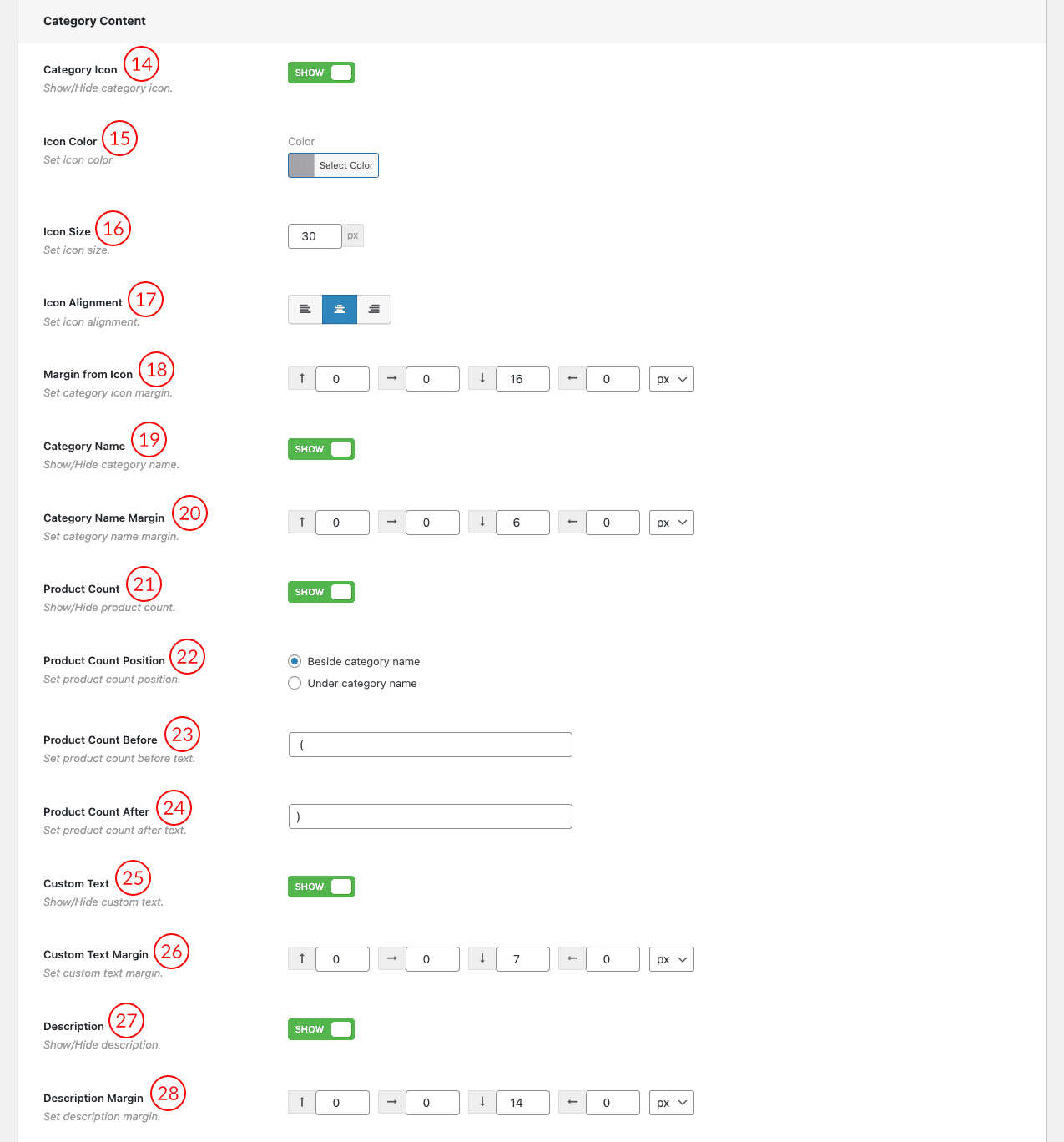
(14) Category Icon: This option controls the ‘Category Icon’ show/hide in the slider. By default, it shows the icon in the slider if you set any. If you want to hide the category icon, then you can hide it by using this button. ‘Icon Color, Icon Size, Icon Alignment, Margin from Icon’ these options depends on this button.
(15) Icon Color: You can change the category icon color. Also, you can use a color code in the option’s field.
(16) Icon Size: Default icon size is 30px. You can increase/decrease the icon size in the px value by using this field.
(17) Icon Alignment: This is the option for set icon alignment. Left, Middle & Right are the available alignment positions in this option.
(18) Margin from Icon: In this option, you’re given two different units by which you can measure the margin of an icon as it’s displayed in the web browser. There are given below.
- Scalable unit ‘em‘.
- Fixed unit ‘px‘.
The default 16px margin on the bottom is set to the icon, you can add left, right, and top margins in this field.
(19) Category Name: This option controls the ‘Category Name’ show/hide in the carousel. By default, it shows the category name in the carousel. If you want to hide the category name, then you can hide it by using this button. ‘Category Name Margin, Set category name margin, Product Count, Product Count Position, Product Count Before & Product Count After‘ these options depends on this button.
(20) Category Name Margin: The default 6px margin on the bottom is set to the Category Name, you can add left, right and top margins in this field.
(21) Products Count: This is the option for showing or hiding the total number of products in the category.
(22) Product Count Position: There are two different positions to show the total number of products in the category.
- Beside Category Name
- Under Category Name
When you select the ‘Under Category Name’ as the position of the product count number then the ‘Product Count Margin’ option will be shown below.
(23) Product Count Before: Type a product count before the text as you like. By default, it is set as “(“
(24) Product Count After: Type a product count After the text as you like. By default, it is set as “)”
(25) Custom Text: There is a custom text field in the product category. If you have created a category with some custom text, you can show/hide this custom text in the slider by using this option.
(26) Custom Text Margin: Same as the ‘Category Name Margin’.
(27) Description: This is the option to show or hide the category description in the slider which has been added to the category.
(28) Description Margin: Same as the ‘Category Name Margin’.
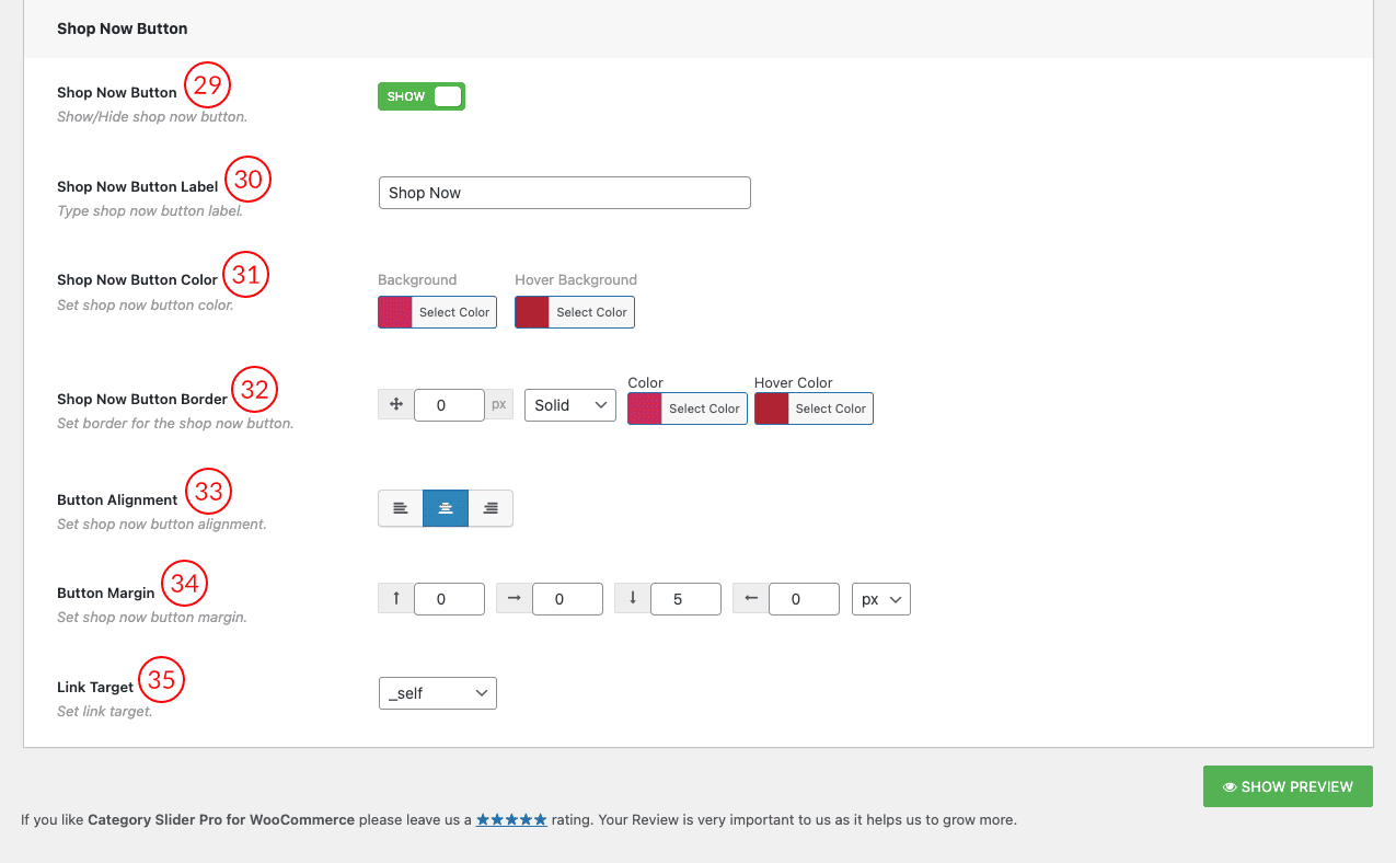
(29) Shop Now Button: This option controls the ‘Shop Now’ button to show/hide in the carousel. By default, it shows the shop now button in the carousel. If you want to hide it from the carousel then you can hide it by using this button. ‘Shop Now Button Label, Shop Now Button Color, Shop Now Button Border, Button Alignment, Button Margin & Link Target‘ these options depend on this button. This button will redirect the user to the category shop page.
(30) Shop Now Button Label: This is the option for changing the label of the ‘Shop Now’ button in the slider. You can add custom text to the label of this button by using this field.
(31) Shop Now Button Color: This option is for changing the Shop now button background color & hover background color. The button text color changing option is under the typography tab of the plugin.
(32) Shop Now Button Border: Set the border for the shop now button. There are border styles, colors & hover color fields in this option.
(33) Button Alignment: Set shop now button alignment from this option. There are three alignment options available here.
(34) Button Margin: Same as the ‘Shop Now Button Margin’.
(35) Link Target:
| _blank | Open in a new window |
| _self | Open in the same frame as it was clicked |
| _parent | Open in the parent frameset |
| _top | Open in the full body of the window |
| frame name | Open in a named frame |