Create and organize unlimited FAQs, product info, or detailed content in a clean, collapsible accordion with the Vertical Accordion Block, keeping pages readable and easy to explore. Choose from Standard, Numbered, Timeline, or Minimalist layouts, and enhance your content with smart interactions, built-in search, SEO-ready FAQ schema, smooth animations, and full customization to match your needs.
How to Add the Vertical Accordion Block:
- Go to your WordPress Dashboard.
- Navigate to Pages > Add New (or edit an existing page).
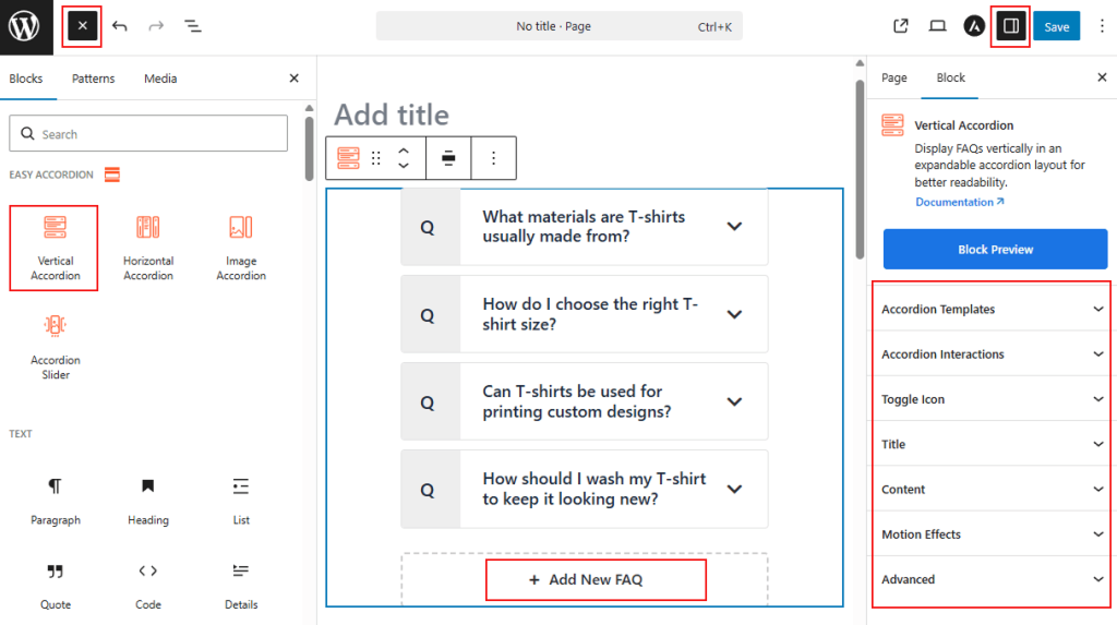
- In the block editor, click the “+” (Add Block) button.
- Search for “Vertical Accordion” under the Easy Accordion category.
- Click to insert the Vertical Accordion Block into your page.
How to Customize Vertical Accordion Block:
Using Vertical Accordion Block, you can display FAQs, product details, or text-heavy content in a clean, collapsible layout. Follow the steps below to add unlimited items and customize the styling as you need.
- Add Unlimited Items: Use the “+ Add New FAQ” button to insert unlimited accordion items.
- Easy Controls: Define which items stay open by default and manage toggle triggers (Click, Mouseover, or AutoPlay).
- Enhance Headers: Add subtitles and unique icons to improve visual hierarchy.
- Full Styling: Customize typography, colors, and spacing to ensure a seamless brand fit.
Now, let’s explore the detailed Settings & Stylings:
Accordion Templates: General
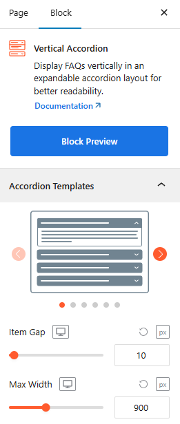
- Versatile Vertical Templates: Choose from diverse presets, including Standard, Numbered, Timeline, and Minimalist styles to fit your brand.
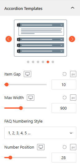
- Item Gap & Max Width: Adjust vertical spacing between items and set the container’s maximum width for perfect alignment.
- Template-Specific Styles: The following settings appear dynamically based on your chosen accordion template:
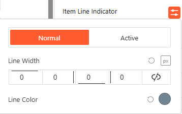
- Item Line Indicator (Minimal Line Template): Adjust the line width and color for normal and active states.
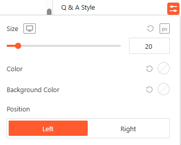
- Q & A Style (Q & A Template): Customize the size, colors, and toggle the position to Left or Right.
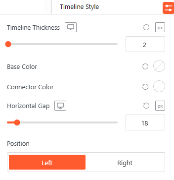
- Timeline Style (Timeline Template): Define the timeline thickness, base/connector colors, and horizontal gap.
- FAQ Numbering Style (Numbering Template): Select the FAQ Numbering style from Number, Roman & Alphabet.
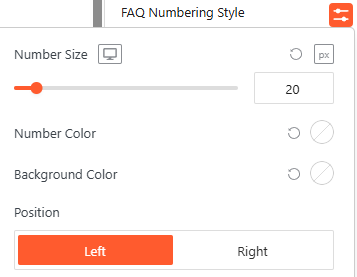
- Style the FAQ Numbering: Set the number size, colors, and choose between Left or Right alignment.
- Advanced Utilities:
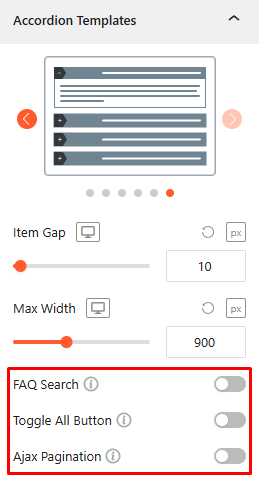
- FAQ Search: Toggle this On/Off, allowing the user to search with instant FAQ filtering with advanced features. For details, click here.
- Toggle All Button: Turn this On/Off, allowing the user to expand or collapse all panels at once. For details, click here.
- AJAX Pagination: Turn this on to load accordion items dynamically, keeping page speed high. For details, click here.
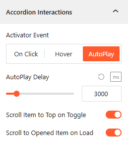
Accordion Interactions:
From the Accordion Interactions panel, you can define how panels trigger, scroll, and link, ensuring a smooth and intuitive browsing experience for your visitors.
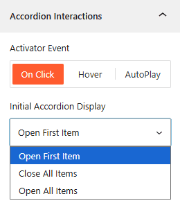
- Activator Event: Choose the trigger to open accordions: On Click, Mouseover, or AutoPlay.
- AutoPlay Delay: If AutoPlay is ON, set the duration (ms) between automatic accordion transitions from here.
- Initial Display: Choose to have the Open First Item, Close All Items, or Open All Items on page load.
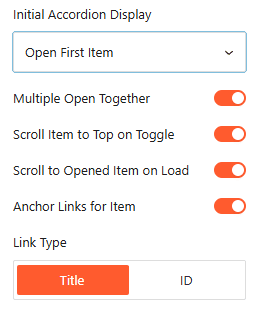
- Multiple Open Together: Turn it On/Off, allowing more than one accordion to remain expanded simultaneously.
- Scroll Item to Top on Toggle: Enable it to automatically align the opened accordion header to the top of the viewport.
- Scroll to Opened Item on Load: Enable it to scroll the browser to an active accordion immediately upon page entry.
- Anchor Links: Enable unique URLs to link directly to specific accordion items.
- Link Type: Generate anchor links based on the Title text or a unique ID.
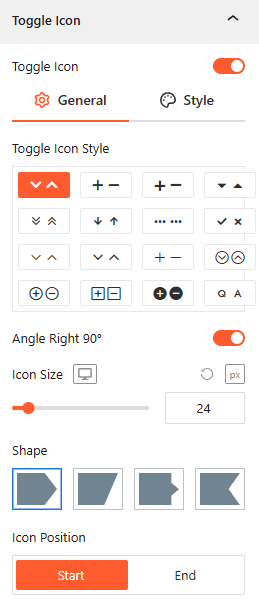
Toggle Icon: General
From the Toggle Icon panel, you can customize the appearance, behavior, and positioning of the icons that indicate whether an accordion item is expanded or collapsed.
- Toggle Icon Style: Select from various icon pairs, like arrows or plus/minus signs, for open and closed states.
- Angle Right 90°: Toggle this to rotate the icon when the accordion panel is active.
- Icon Size: Use the responsive slider to set the icon’s pixel size across different devices.
- Shape: Choose a background container shape for the icon from four different styles, such as square or slanted.
- Icon Position: Set the toggle icon to appear at the Start or End of the Title.
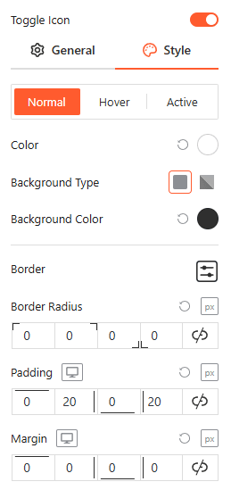
Style Toggle Icon:
Customize the colors, background types, borders, and spacing of your icons for Normal, Hover, and Active states from here.
Title: General
From the Title panel, you can configure the structural tags, alignment, and sub-labels for your accordion headers to improve both SEO and visual hierarchy.
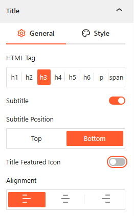
- Choose HTML Tag: Select the appropriate heading tag (h1–h6, p, or span) to ensure correct SEO structure for your questions.
- Enable Subtitle: Toggle this on to add a secondary line of text to your accordion header.
- Subtitle Position: Define whether the subtitle appears at the Top or Bottom of the primary title.
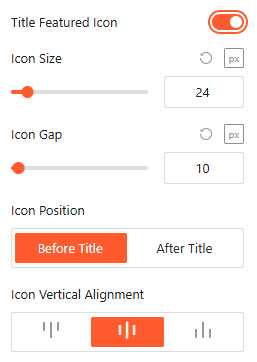
- Enable Title Featured Icon: Use this toggle to show/hide a dedicated icon that sits specifically within the title area.
- Icon Size & Gap: Set the exact pixel dimensions of the featured icon.
- Icon Gap: Adjust the spacing between the featured icon and the title text.
- Icon Position: Choose to place the featured icon either Before Title or After Title.
- Vertical Alignment: Align the icon to the Top, Middle, or Bottom relative to the title text line.
- Alignment: Set the text and icon justification to Left, Center, or Right.
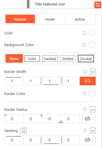
Style Featured Icon:
Use this panel to adjust the featured icon’s color, border width, and padding across different interaction states to create a distinct visual anchor.
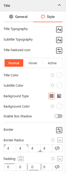
Style Title & Subtitle:
This panel allows you to define typography, box shadows, and background colors for Titles & Sub-Titles in Normal, Hover, and Active states while managing border radius and internal padding.
Content: General
From the Content panel, you can control the height, visibility, and animation of your accordion’s expanded area to ensure your answers are presented clearly.
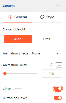
- Content Height: Select Auto for natural expansion or Limit to set a specific maximum height for the content area.
- Animation Effects: Choose visual effects from 10 more styles for the content when it expands to create a more dynamic feel.
- Animation Delay: Define the autoplay delay time (in ms) before the opening animation begins.
- Close Button: Toggle this on to add a dedicated button inside the expanded area for manual collapsing.
- Button on Hover: Enable this to make the close button visible only when the user hovers over the content area.
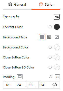
Style Content:
From this panel, you can customize the typography, background types, and colors for the content and close button while managing internal padding for a clean layout.
Motion Effects:
From the Motion Effects panel, you can add animations and interactive movement to your accordion, making the content feel more dynamic as users scroll or interact.
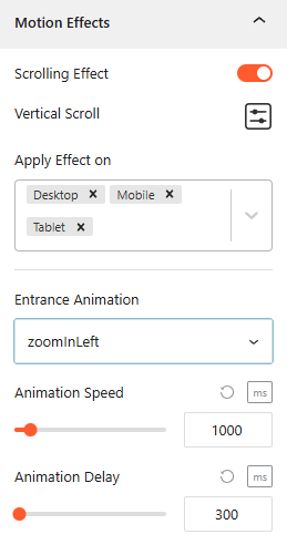
- Enable Scrolling Effects: Use this toggle to enable or disable scroll-based interactions.
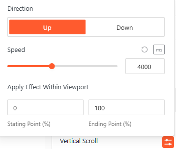
- Vertical Scroll: Use this to set how the animation will appear. Set the Direction to (Up/Down), speed, and apply the effect within the viewport.
- Apply Effect ON: Set the devices, such as Desktop, Tablet, or Mobile, to apply the effect on.
Advanced Settings:
The Advanced panel allows you to manage the overall container of the accordion, covering visibility, accessibility, and high-level styling.
General:
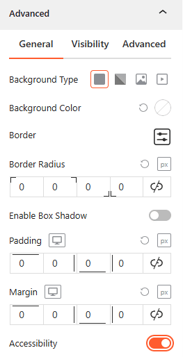
- Background & Border: Set the background type (Solid, Gradient, Image, or Video), border-radius, and box shadows for the main block container.
- Spacing: Define the precise Padding and Margin (in px) for the entire accordion structure.
- Accessibility: Enable this toggle to ensure the accordion follows standard web accessibility guidelines for screen readers and keyboard navigation.
Visibility:
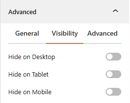
- Device Hiding: Toggle visibility on or off to hide the entire accordion block on Desktop, Tablet, or Mobile viewports for better responsive control.
Advanced:
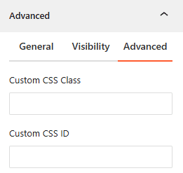
- Custom CSS: Apply a unique Custom CSS Class or Custom CSS ID to the block for deep styling or advanced developer hooks.