Create and showcase interactive image content with the Image Accordion Block, where images expand to reveal titles, descriptions, and call-to-action buttons. Choose from horizontal or vertical layouts with stylish hover presets, and enhance your visuals with smart interactions, lightbox support, smooth animations, and full customization to match your brand.
How to Add the Image Accordion Block:
- Go to your WordPress Dashboard.
- Navigate to Pages > Add New (or edit an existing page).
- In the block editor, click the “+” (Add Block) button.
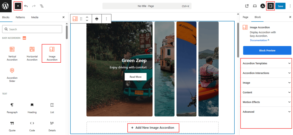
- Search for “Image Accordion” under the Easy Accordion category.
- Click to insert the Image Accordion Block into your page.
How to Customize Image Accordion Block:
Using the Image Accordion Block, you can create an interactive image gallery where visuals expand to reveal content. Follow the steps below to add unlimited items and customize the styling as you need.
- Add Unlimited Images: Use the “+ Add New Item” button to insert multiple image accordion items.
- Control Interactions: Choose how images expand using Click, Mouseover, or AutoPlay triggers.
- Enhanced Content: Show or hide titles, descriptions, icons, buttons, and lightbox options for better engagement.
- Full Styling: Customize image effects, overlays, typography, spacing, animations, and container styles for a polished brand look.
Now, let’s explore the detailed Settings & Stylings:
Accordion Templates: General
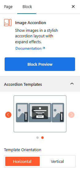
- Two Stunning Templates: Choose from 2 stylish hover on image presets to suit your brand’s needs.
- Template Orientation: Toggle between Horizontal and Vertical layouts to control the direction of the expansion.
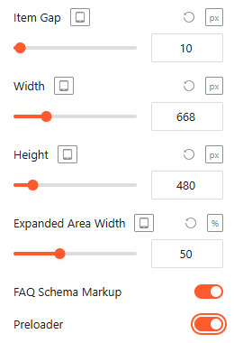
- Spacing: Set item Item Gap, Width, and Height in pixels for a precise fit across devices from here.
- FAQ Schema: Enable this toggle to automatically apply structured data for search engine visibility.
- Preloader: Enable it to show a smooth loading animation while the block loads on the page.
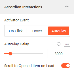
Accordion Interactions:
From the Accordion Interactions panel, you can define how panels trigger, scroll, and link, ensuring a smooth and intuitive browsing experience for your visitors.
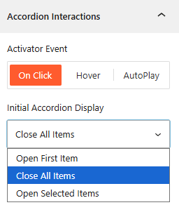
- Activator Event: Choose the trigger to open accordions: On Click, Mouseover, or AutoPlay.
- AutoPlay Delay: If AutoPlay is ON, set the duration (ms) between automatic accordion transitions from here.
- Open Selected Item: Select it to set the number of accordion items you want to show on Click, while keeping other items collapsed.
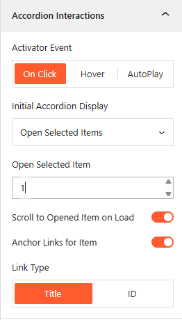
- Scroll to Opened Item on Load: Enable it to scroll the browser to an active accordion immediately upon page entry.
- Anchor Links: Enable unique URLs to link directly to specific accordion items.
- Link Type: Generate anchor links based on the Title text or a unique ID.
Image: General
From the Image panel, you can manage the visual behavior, interactive effects, and Lightbox settings for each accordion item.
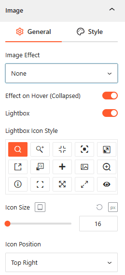
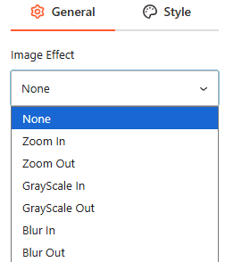
- Image Effect: Select from various visual styles, including Zoom In/Out, GrayScale In/Out, or Blur In/Out.
- Effect on Hover (Collapsed): Enable this toggle to trigger visual effects when a user hovers over an unexpanded item.
- Lightbox: Enable this feature to allow users to view images in a full-screen overlay.
- Lightbox Icon Style: Choose from 15+ different icon designs to represent the zoom action.
- Icon Size: Set the responsive pixel size of the Lightbox icon.
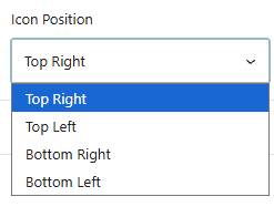
- Icon Position: Define where the icon appears on the image, such as Top Right, Top Left, Bottom Right, or Bottom Left.
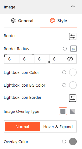
Style Image:
From this image style panel, you can easily customize the Image Typography, Border Radius, Overlay Colors, and Icon Backgrounds for both Normal and Hover states.
Content: General
From the Content panel, you can manage the visibility, layout, and styling of the text and interactive elements overlaying your images.
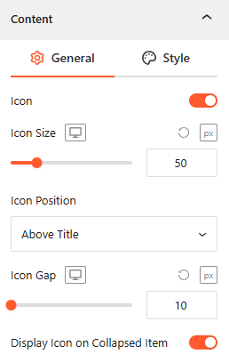
- Icon Integration: Toggle this on to enable an Icon, adjust its Size and Gap, and specify its position above the title or left of the contents.
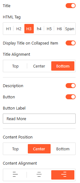
- Show/Hide Title, Description & Button: Toggle the Title, Description, and Button switches to control which content appears on your accordions.
- Title Customization: Select the appropriate HTML Tag (H1–H6 or Span) and set the Title Alignment to Top, Center, or Bottom.
- Title Visibility: Choose whether to Display Title on Collapsed Item to keep headings visible even when the panel is closed.
- Button: Customize the Button Label (e.g., “Read More”) and adjust the overall Content Position and alignment within the frame.
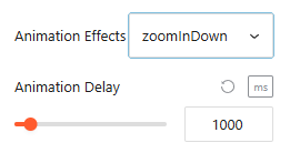
- Animation Effects: Apply dynamic Animation Effects like “zoomInDown” and set a specific Animation Delay (in ms) for an engaging entrance.
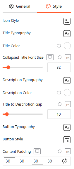
Style Content:
From the Content Style panel, you can customize Icon Style, Title, and Description Typography and Color, Collapsed Title Font Size, Title to Description Gap, Button Typography and Style, and Content Padding.
Motion Effects: General
From the Motion Effects panel, you can add animations and interactive movement to your accordion, making the content feel more dynamic as users scroll or interact.
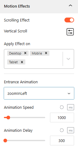
- Enable Scrolling Effects: Use this toggle to enable or disable scroll-based interactions for the block.
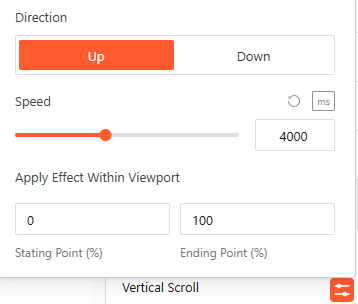
- Vertical Scroll: Define the animation Direction (Up/Down) and Speed, and apply the effect within specific viewport ranges.
- Apply Effect On: Choose which devices — Desktop, Tablet, or Mobile—will display these motion effects.
- Entrance Animation: Select how the accordion appears when entering the viewport, with options like Fade In, Slide Up, Zoom In, or Bounce.
- Animation Speed & Delay: Precisely set the Animation Speed and adjust the Animation Delay (in ms) to control the timing of the reveal.
Advanced Settings:
The Advanced panel allows you to manage the overall container of the accordion, covering visibility, accessibility, and high-level styling.
General:
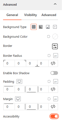
- Background & Border: Set the background type (Solid, Gradient, Image, or Video), border-radius, and box shadows for the main block container.
- Spacing: Define the precise Padding and Margin (in px) for the entire accordion structure.
- Accessibility: Enable this toggle to ensure the accordion follows standard web accessibility guidelines for screen readers and keyboard navigation.
Visibility:
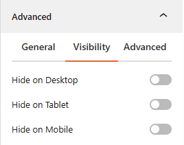
- Device Hiding: Toggle visibility on or off to hide the entire accordion block on Desktop, Tablet, or Mobile viewports for better responsive control.
Advanced:
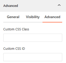
- Custom CSS: Apply a unique Custom CSS Class or Custom CSS ID to the block for deep styling or advanced developer hooks.