
(1) Accordion Section Title: If the option is set to ON, the Accordion title will be shown as the section title on the frontend. The feature is turned OFF by default.
(2) Margin Bottom from Section Title: A user can also set a Margin between the section title and the accordion from this option. The default margin is set to 30px.

(3) Margin Between Accordion Items: The feature is to set a margin between items. It will create a space/gap between the items. The default value is 10px.

Accordion Expand & Collapse Icons

(4.1) Expand & Collapse Icon: The feature is to Show/Hide Expand-Collapse icons in the accordion. These icons make an accordion fascinating. If the feature is turned ‘ON’, the icons will be shown in the accordion.
Note: Keeping ‘ON’ the ‘Font Awesome CSS’ from the ‘Settings’ field is mandatory. If there is another font-awesome file on the site, it can be kept ‘OFF’ from the ‘Settings’ field to avoid extra loading.
(4.2) Expand & Collapse Icon Style: There are fifteen sets of icons to use for Expanding & Collapsing. Select an Icon style for your Accordion.

(4.3) Expand & Collapse Icon Size: This feature is used to adjust the Expand & Collapse Icon Size. As the icon position is with the title in the accordion and the title’s font size can be different on the various pages, it is needed to adjust the icon size to look better. Also, you can stylize your accordion by increasing or decreasing the icon size from here. The default icon size is 16 px.
(4.4) Margin Between Collapsible Icon and Title: A user can easily set the space between the Collapsible icon and the title. The margin applies from the right side of the icon and it can be kept in mind when a user sets the icon’s position to ‘Right’ from the below option. The default value is 10px.

(4.5) Icon Color: Set Collapsible Icon Color, Active Color, and Hover Color.
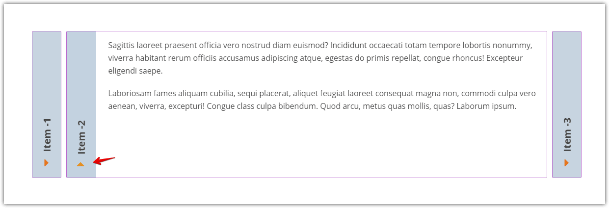
(4.6) Expand & Collapse Icon Position: The Expand & Collapse Icon can be positioned in two places for each Accordion Layout. Such as:
Vertical Mode:
- Left
- Right
Left

Right

Horizontal Mode:
- Top
- Bottom
Top:

Bottom:
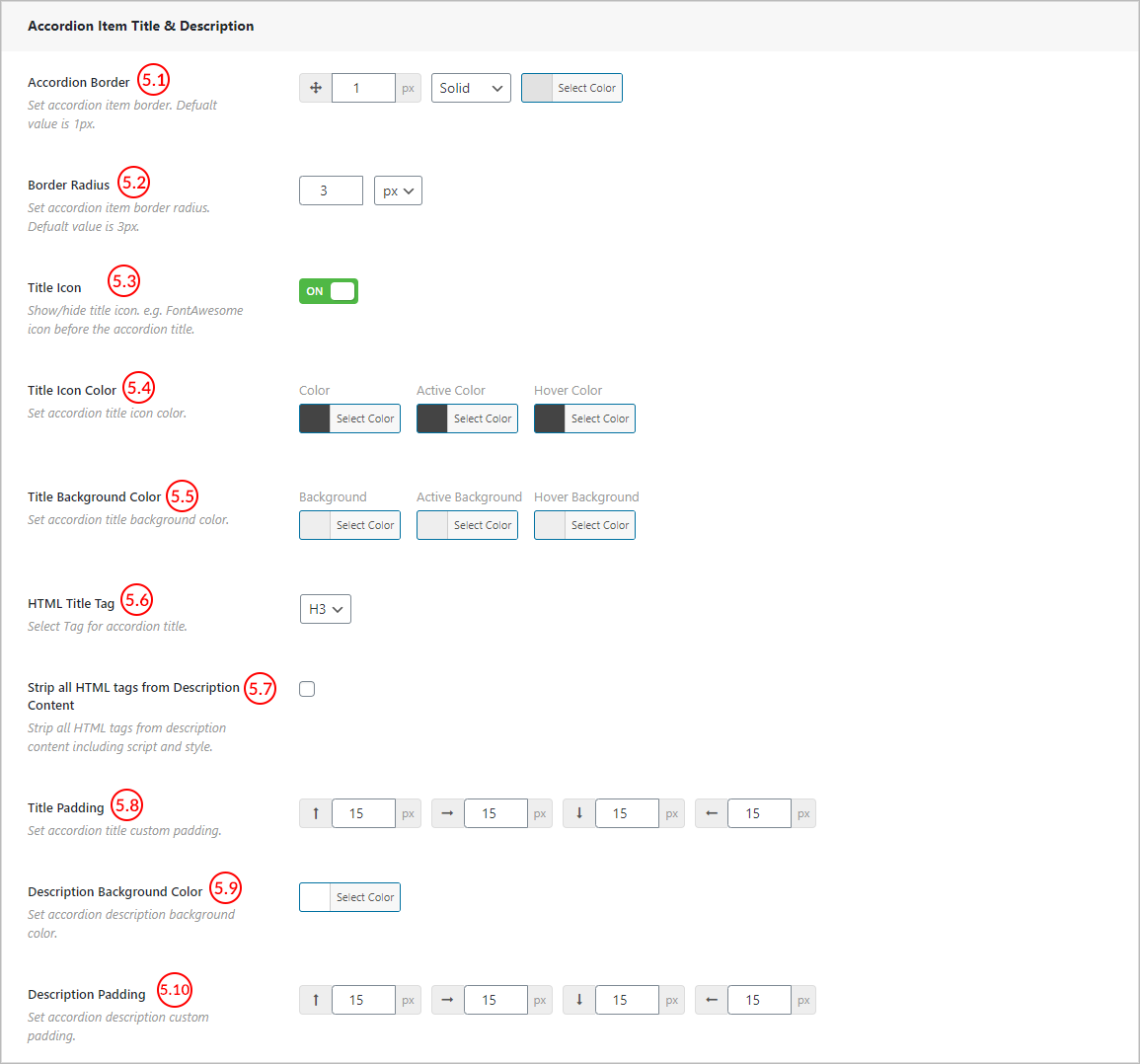
(5.1) Accordion Border: A user can set a customized border for Accordion items from here. Available Options:
- Border size
- Border Style
- Border Color

(5.2) Border Radius: Set border radius for the Accordion items from here. By default border radius for the accordion item is set to 3px.
Example:
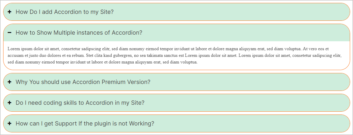
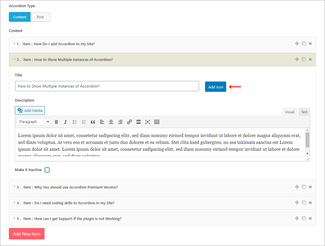
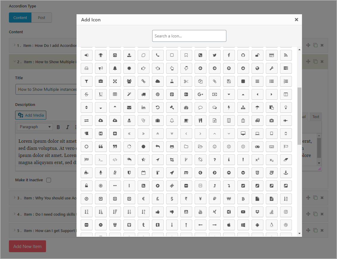
(5.3) Title Icon: ON/OFF Title icon (FontAwesome icon) before the accordion title as you want.
To add the icon for a title, there is an Add Icon button in the editor field. Add an icon by clicking on this button and keep the ‘Title Icon’ switch ON.
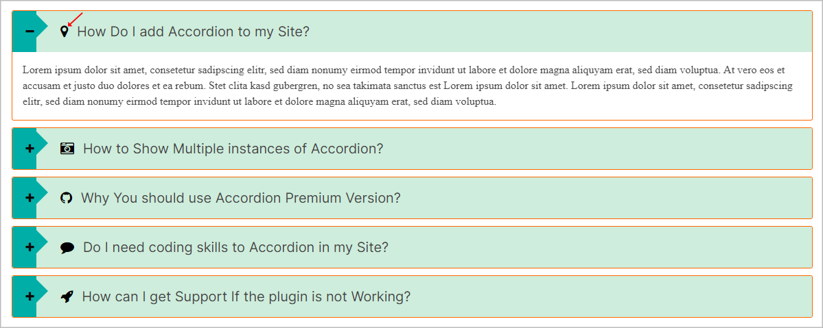
(5.4) Title Icon Color: This feature is to set a Color, Active Color, Hover Color for the title’s icon.
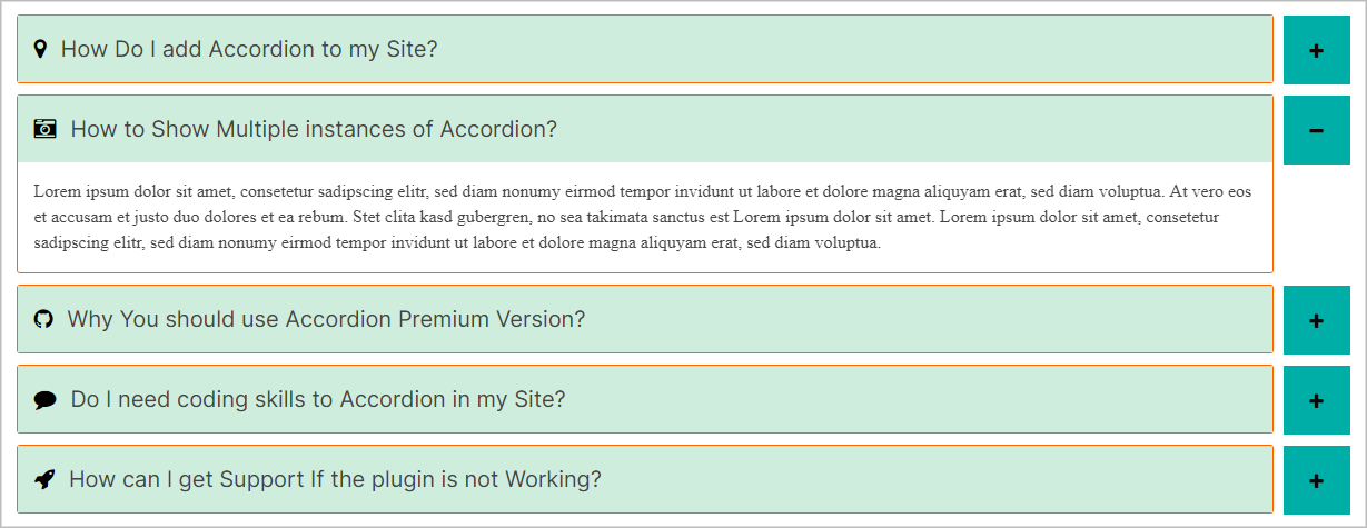
(5.5) Title Background Color: Set a background Color, Active Color, Hover Color for the Title area from this option.
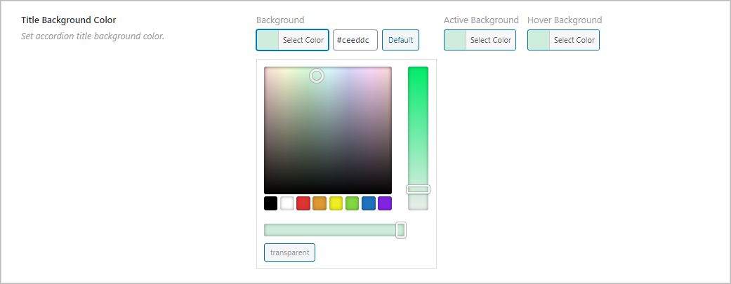
Example:
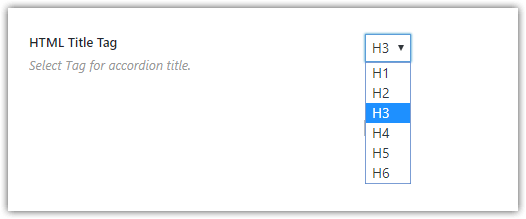
(5.6) HTML Title Tag: A user can define a heading tag for the title text like H1, H2, H3, H4, H5, H6 with this feature. This title tag plays an important role in terms of SEO. It helps a page to get a good rank on the search engine.

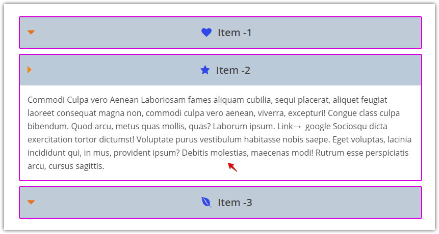
(5.7) Strip all HTML tags from Description Content: Sometimes it is needed to show the content by removing the HTML markup from accordion items. Stripping HTML tags can be done with this feature.
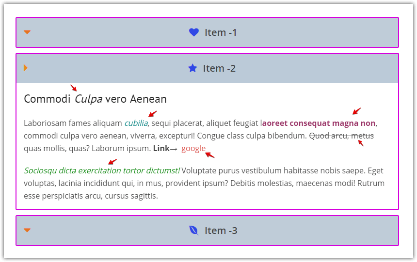
If the feature is checked, the content will be displayed without HTML markup and style.
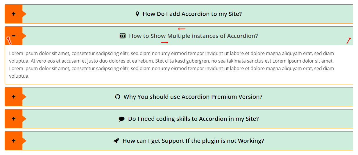
(5.8) Title Padding: This feature is used to set Title Padding for the accordion items. A user can easily set padding at the top, bottom, left, and right of the titles.
(5.9) Description Background Color: A user can easily set the background color for accordion descriptions from this option.
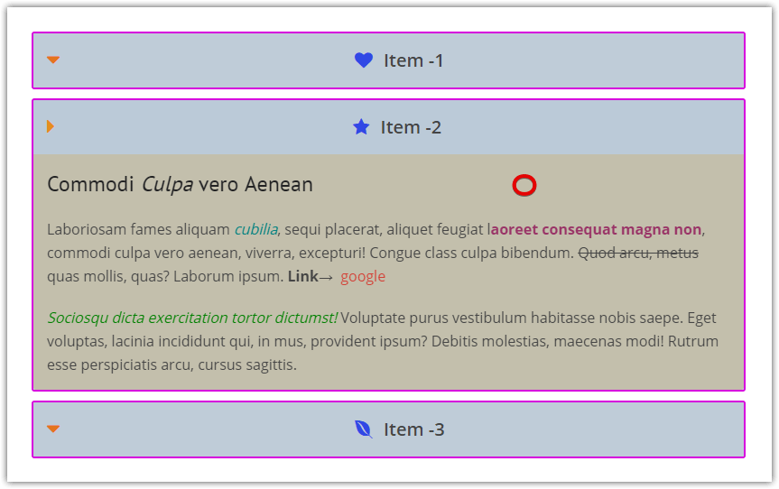
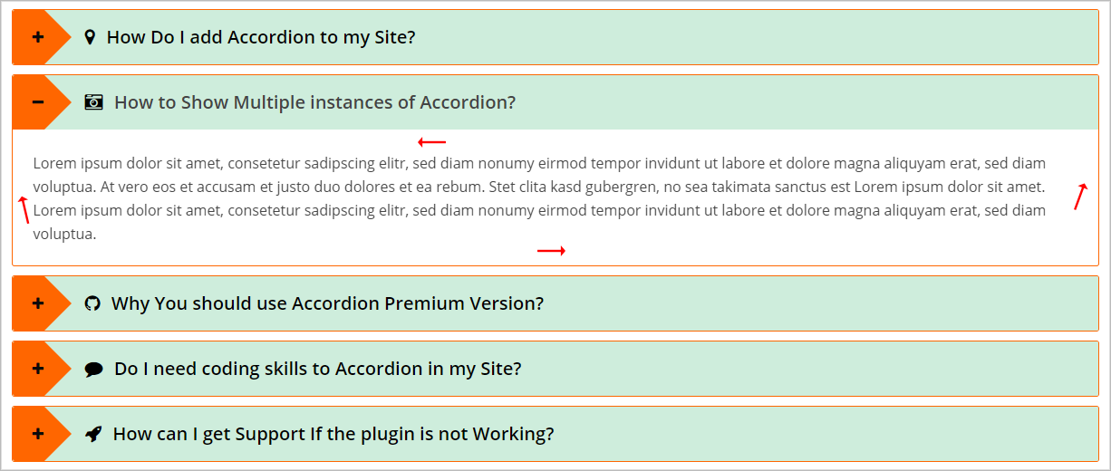
(5.10) Description Padding: This feature is to set Description/Content padding for the accordion items. A user can easily set Padding at the Top, Bottom, Left, and Right of the description/content.
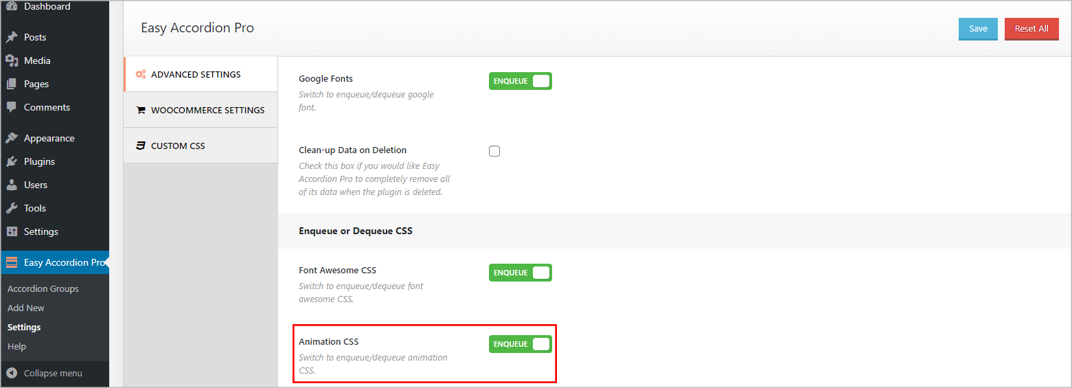
(6.1) Animation: This switch is to turn ‘ON/OFF’ the animation feature for an accordion.

Note: The animation feature won’t work if the ‘Animation CSS’ file is dequeued from the ‘Settings → ADVANCED SETTINGS’ field of the plugin.
(6.2) Animation Style: A user can set a Style of Animations from here. There are 21 types of Animations.
Available animations are:
- FadeIn
- FadeInLeft
- FadeInUp
- FadeInDownBig
- Shake
- Swing
- RollIn
- Bounce
- Wobble
- SlideInDown
- SlideInLeft
- SlideInUp
- ZoomIn
- ZoomInDown
- ZoomInUp
- ZoomInLeft
- BounceIn
- BounceInDown
- BounceInUp
- Jello
- RubberBand
(6.3) Transition Time: The ‘Transition Time’ feature refers to the opening and closing time of an accordion item. The default value is 500ms.
Value Increasing Effect: An accordion item will open and close slowly.
Value Decreasing Effect: An accordion item will open and close quickly.