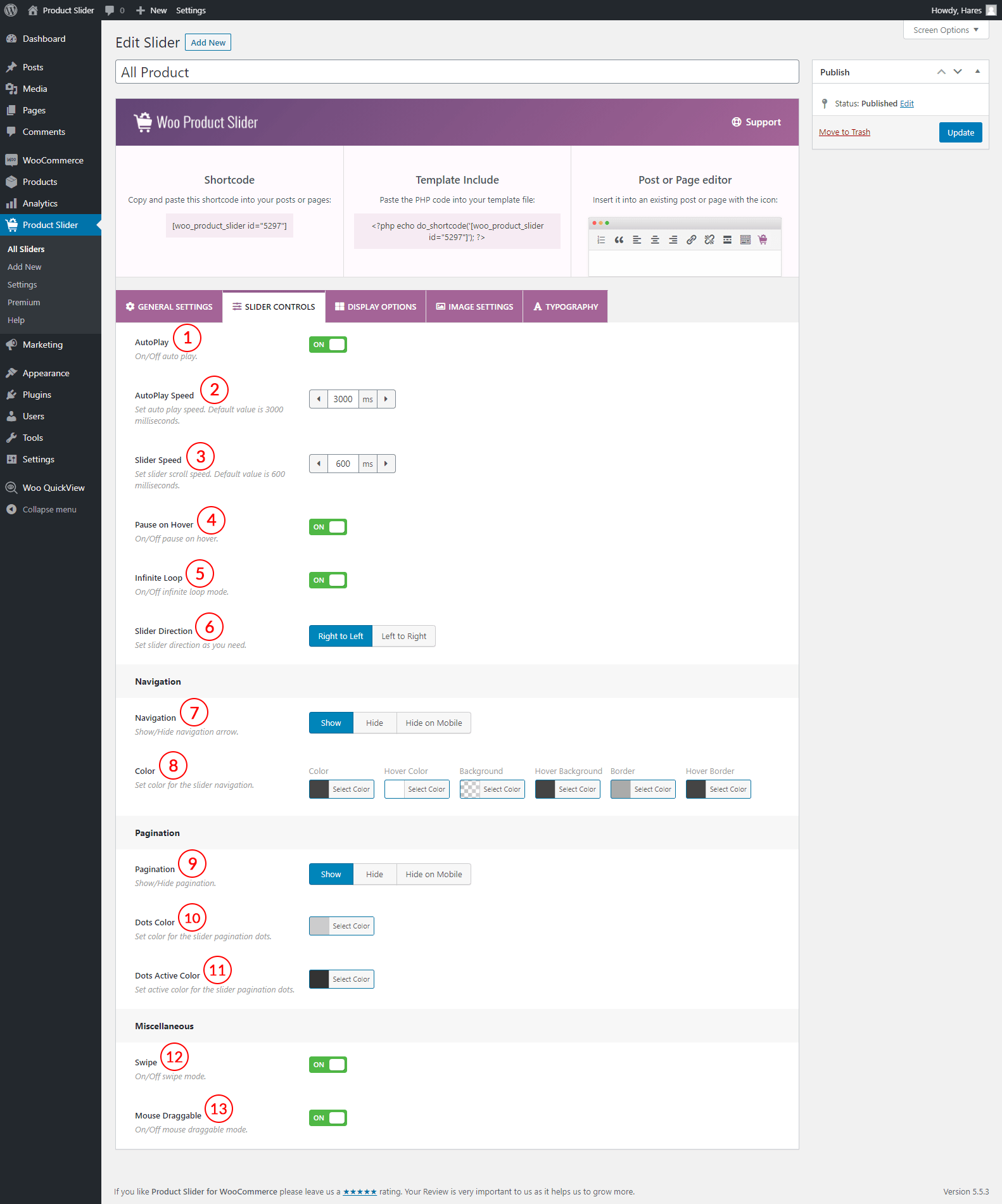
(1) AutoPlay: AutoPlay means the carousel will start as soon as the page loading is done. You can either turn ON or turn OFF this feature. If you turn ON it, the carousel will start playing once the page loading is finished.
(2) AutoPlay Speed: If you turn ON autoplay, you will get an additional setting option. It allows you to set the autoplay speed of the carousel. The default value is 3000 milliseconds.
(3) Sliding Speed: Set sliding or scrolling speed. The default value is 600 milliseconds.
(4) Pause on Hover: If you turn ON this feature when you hover on the carousel, it will stop playing. You can either turn ON or OFF pause on the hover feature.
(5) Infinite Loop: Infinite loop is a sequence of instructions that continues endlessly. If you turn ON the infinite loop for the carousel, it means that the carousel will continue endlessly.
(6) Slider Direction: Set the slider direction as per your need. The following two directions are available to set-
- Right to Left
- Left to Right
(7) Navigation: Navigation allows users to navigate the slider items easily. You can either show or hide the carousel navigation. There is also an individual option for the mobile view. The following options are available for navigation-
- Show
- Hide
- Hide on Mobile
(8) Color: You can style the navigation with navigation color setting options. The following color options are available for navigation.
- Color
- Hover Color
- Background
- Hover Background
- Border
- Hover Border
(9) Pagination: Pagination allows users to paginate the slider items one by one. You can show or hide the carousel pagination. There is also an individual option for the mobile view. The following options are available for navigation-
- Show
- Hide
- Hide on Mobile
(10) Dots Color: Pagination provides dots to paginate the slider items. You can style these dots. Set color for the slider pagination dots.
(11) Dots Active Color: Highlight the active pagination dot by styling it. Set the active color for the slider pagination dots.
(12) Touch Swipe: You can either turn ON or OFF the touch-swipe mode for the carousel.
(13) Mouse Draggable: Mouse draggable allows you to see the carousel items by dragging them with the mouse. You can turn ON or OFF mouse draggable mode. If this feature is turned ON, users will be able to see the carousel items with mouse dragging.